restylai blog
Interior Color Schemes: A Guide With Examples
Updated July 19, 2026 · by the restylai team
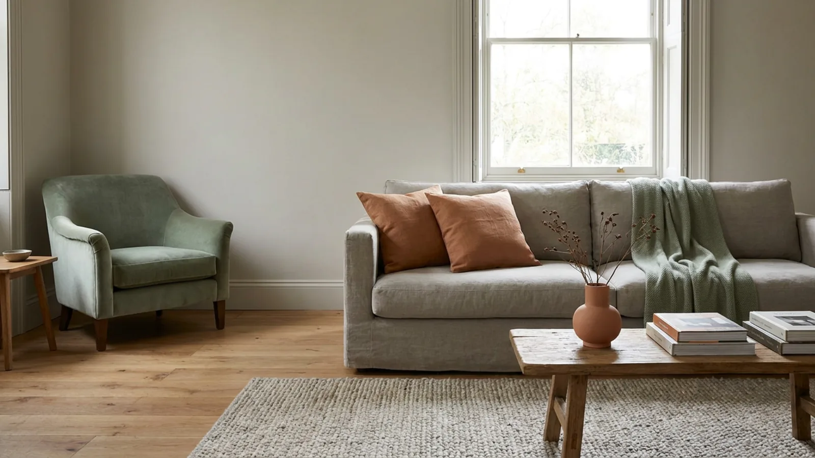
Color is the fastest way to change how a room feels, and the easiest thing to get wrong. Most rooms that feel off are not badly furnished, they are badly colored: too many competing tones, an accent that fights the floor, a white that goes cold against the light. A color scheme is simply a plan that prevents all of that, a small set of colors chosen to work together, in proportions that keep the room calm. Once you understand how schemes are built, choosing colors stops being a gamble.
This guide explains what a color scheme is, the 60-30-10 rule that makes any palette work, how to pick a base temperature, the calm and bold scheme types, the undertones that make or break a palette, and room-by-room examples, then shows how to test any scheme on your own room.
What an interior color scheme actually is
An interior color scheme is a deliberate combination of colors used together in a room or a home, usually a base color, one or two secondary colors, and an accent, chosen so they relate to each other rather than clash. That is the whole idea: not a single favorite color, but a small family of colors with defined roles. The base sets the mood, the secondary supports it, and the accent adds life.
A practical way to start is to pull your scheme from something already in the room that you cannot easily change: the floor, a rug you love, a large piece of art, the stone on a worktop, or a sofa you are keeping. Take two or three colors from that fixed element and build the scheme around them, so the new colors are guaranteed to agree with the ones you are stuck with. This one habit prevents the most common failure, choosing a beautiful palette that fights the floor you already have.
The reason to work from a scheme rather than pick colors one at a time is consistency. A room where every color has a job and a proportion reads as calm and intentional, while a room of unrelated favorites reads as busy, even if each color is lovely on its own. A scheme also travels: the same small family of colors, used in different amounts, can tie a whole home together. Everything below is a way of building that small, well-related family, and you can see any of them on your own space when you redesign a room from a photo.
The 60-30-10 rule that makes any palette work
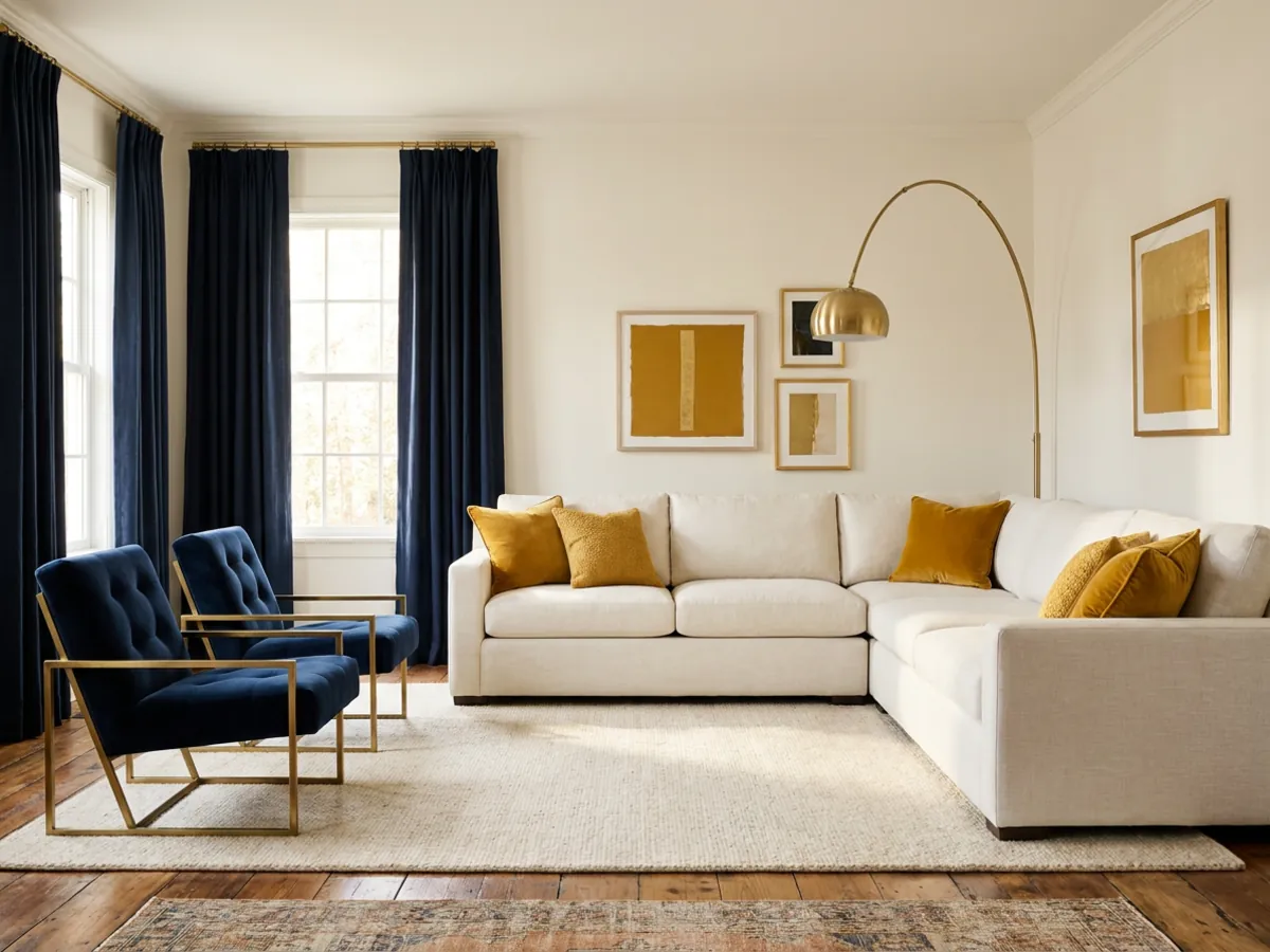
If you remember one thing about color schemes, make it this. The 60-30-10 rule sets the proportions: about 60 percent of the room in a dominant base color, 30 percent in a secondary color, and 10 percent in an accent. The base is usually the walls and large furniture, the secondary shows up in upholstery, bedding, or curtains, and the accent appears in small doses, cushions, art, a single chair, an object.
This proportion is what makes almost any combination of colors feel balanced rather than chaotic. It gives the eye a clear hierarchy: something to rest on, something to support it, and something to spark interest. The most common color mistake is using too much of a bold color, and 60-30-10 is the simplest cure, because it caps the loud color at roughly a tenth of the room. Get the proportions right and even an adventurous palette stays composed.
Warm, cool, and neutral: choosing your base temperature
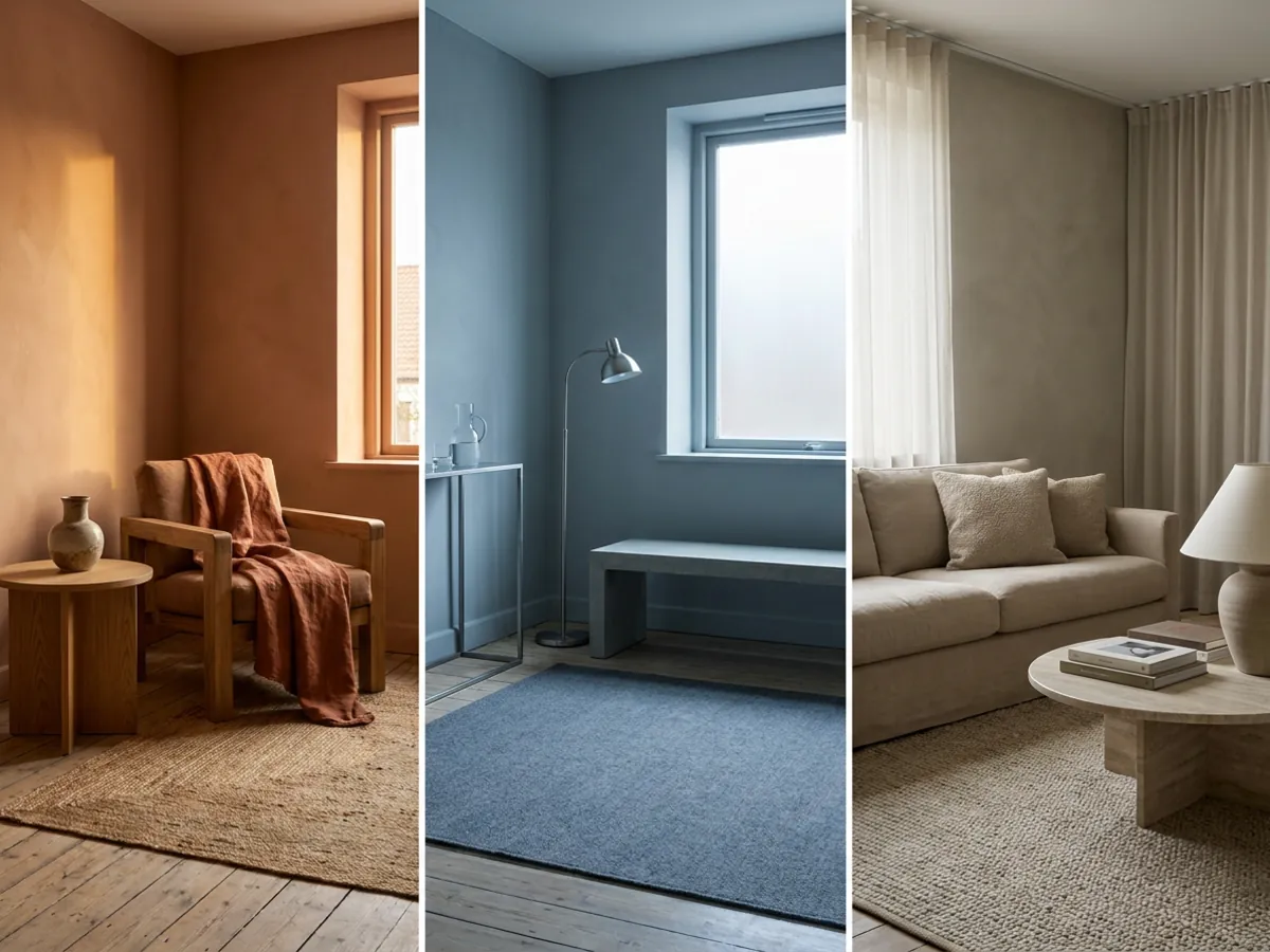
Before choosing specific colors, choose a temperature, because it sets the whole mood of the room. Warm schemes, built on reds, oranges, yellows, and warm woods, feel cozy, inviting, and energetic. Cool schemes, built on blues, greens, and grays, feel calm, restful, and spacious. Neutral schemes, built on whites, beiges, greiges, and taupes, feel timeless and flexible, and are the easiest base to live with and to build on.
Temperature also interacts with your room's natural light. A north-facing room with cool daylight often benefits from a warmer scheme to balance it, while a bright south-facing room can carry cooler tones comfortably. Deciding warm, cool, or neutral first narrows every later choice, because it tells you which direction your base, secondary, and accent should all lean. Most calm, liveable homes start from a neutral or gently warm base and add temperature through the accent.
Calm schemes: monochromatic and analogous palettes
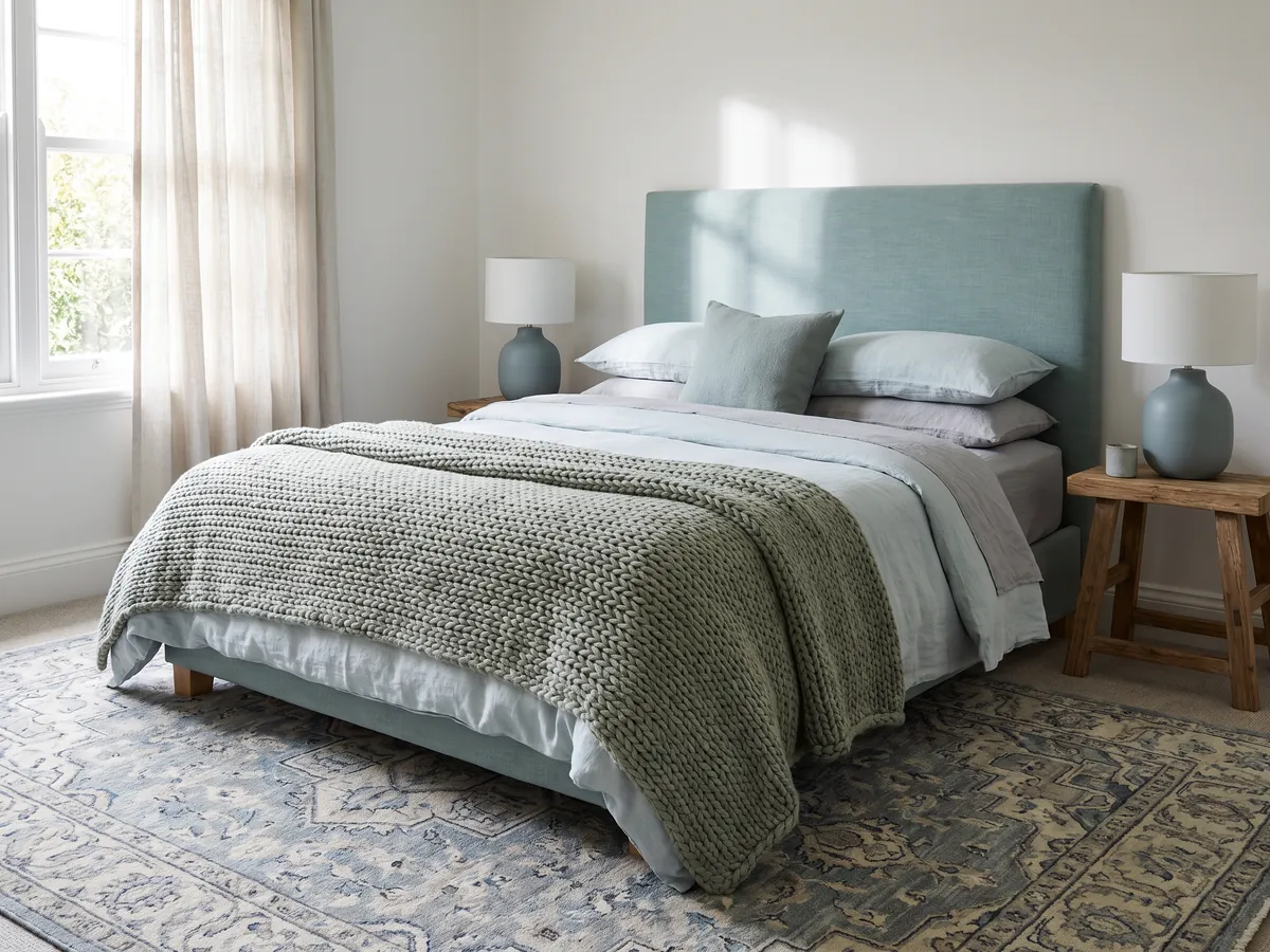
The two most restful scheme types are the ones that keep colors close together. A monochromatic scheme uses one color in several shades and tones, a room of soft to deep greiges, or pale to mid blues, which reads as serene and sophisticated because there is no contrast to jar the eye. A analogous scheme uses colors that sit next to each other on the color wheel, like green, sage, and blue-green, which feels harmonious and natural, the way colors group in a landscape.
Both are forgiving and hard to get wrong, which makes them ideal for bedrooms and any space you want to feel calm. The trick with a low-contrast scheme is to lean on texture and material to keep it from feeling flat, a linen weave, a wood grain, a matte and a sheen, so the room has depth even without color contrast. If you want restful over lively, start here.
Bold schemes: complementary and triadic palettes
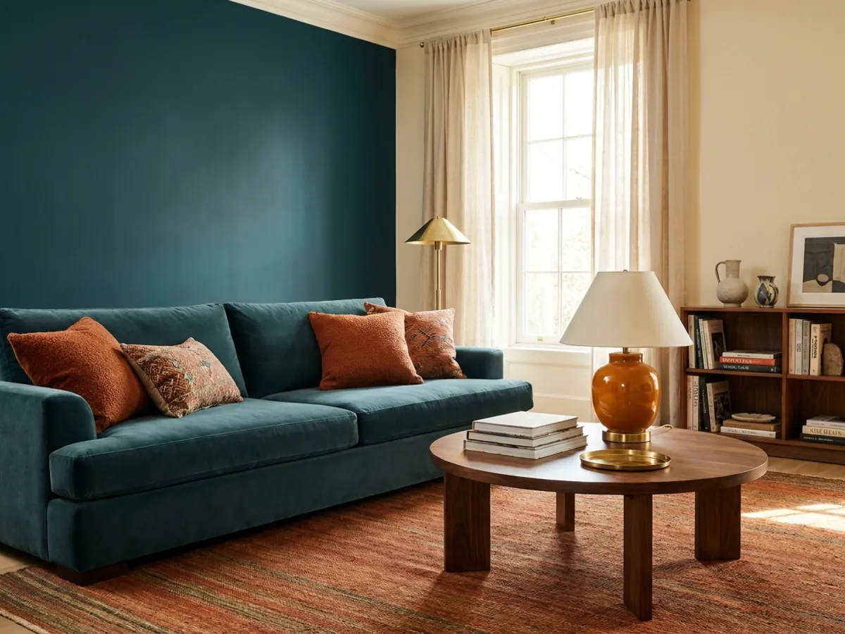
When you want energy and contrast, reach for schemes that combine colors from different parts of the wheel. A complementary scheme pairs two opposite colors, blue and orange, green and terracotta, which creates lively contrast and makes each color look richer. A triadic scheme uses three colors evenly spaced on the wheel for a balanced but vibrant, playful effect.
These schemes have more impact and more risk, so the 60-30-10 rule matters most here. Keep one color dominant and neutralized, let the second play a supporting role, and reserve the boldest color for the 10 percent accent. A room with a soft neutral base, a muted blue secondary, and a punch of terracotta reads as confident, not chaotic. Bold schemes reward restraint: the drama comes from where the strong color lands, not from how much of it there is.
Undertones: the detail that makes or breaks a palette
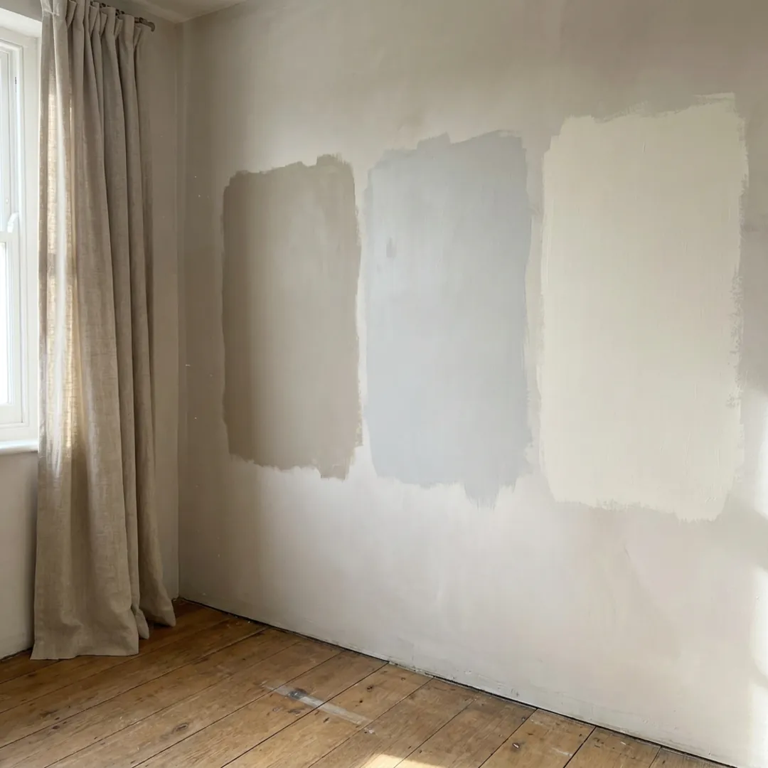
This is the detail that quietly sinks more schemes than any other. Every color has an undertone, a subtle secondary hue underneath the main one: a beige can lean pink, yellow, or green; a white can lean warm or cool; a gray can lean blue or brown. Two colors that look like they should match can clash badly if their undertones fight, which is why a scheme that worked on a screen can feel wrong on the wall.
The fix is to check colors together, at full scale, in your room's own light, because undertones shift dramatically between a shop, a screen, and your north-facing living room at 4pm. A greige that looked warm in the store can turn cold and purple against your floor. This is exactly where previewing a scheme on a photo of your actual room, in its real light, saves an expensive mistake, and it is worth comparing tools in dedicated interior design software for exactly this reason.
Living room color schemes
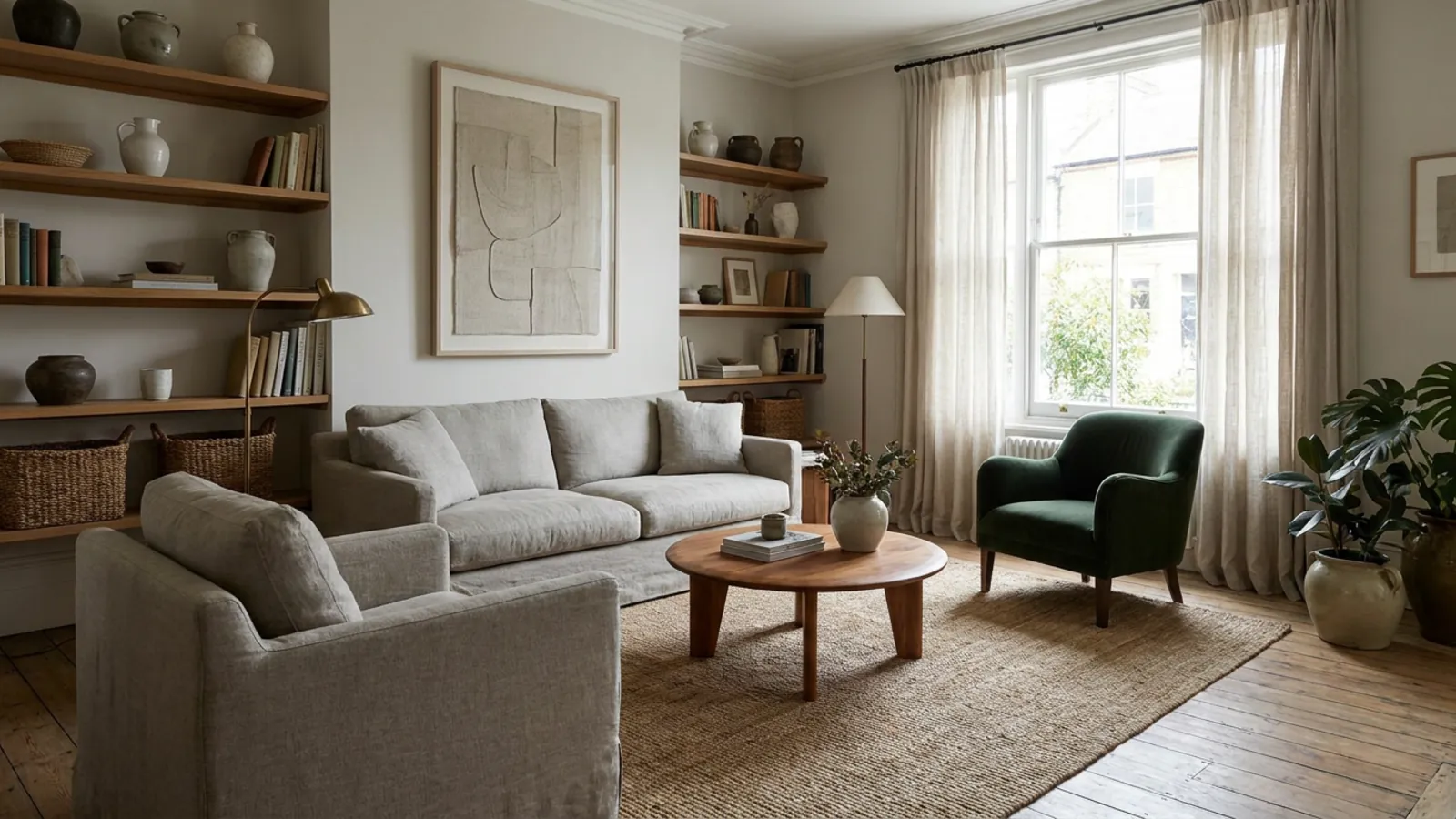
The living room usually wants a scheme that is welcoming but liveable, since you spend a lot of time in it and it often connects to other rooms. A reliable formula is a warm neutral base, a supporting secondary in a muted tone, and one confident accent: greige walls, a soft clay or deep green sofa or chair, and warm wood and brass in the details. It feels considered without being loud, and it ages well.
If your living room opens onto a kitchen or hall, keep the base and secondary consistent across them and let only the accent change, so the spaces feel connected. And because the living room is the room guests see first, it is the one most worth previewing before you commit to paint or a large sofa, so you can be sure the scheme reads the way you imagine in your own light.
Bedroom color schemes
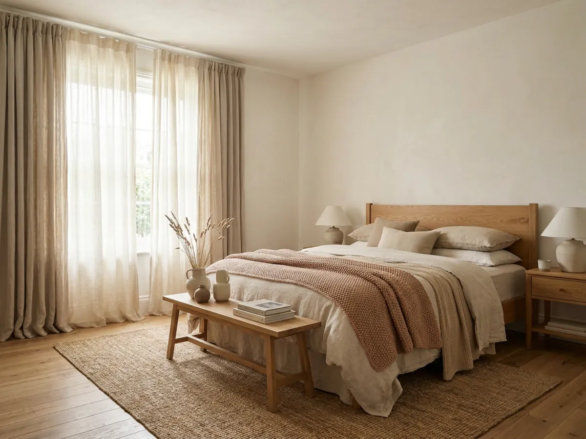
Bedrooms are the natural home of the calm schemes above. A monochromatic or analogous palette in soft, warm tones, oat and greige, or a gentle sage and blue-green, creates the restful feeling a bedroom wants. Keep contrast low and let layered natural textures, linen, wood, wool, carry the interest instead of bold color. A single muted accent, a terracotta cushion, a deep green throw, is plenty.
The one thing to avoid in a bedroom is a high-contrast or cool, clinical scheme, which works against rest. If you love a color, bring it in as the 10 percent accent rather than the base. You can design a bedroom scheme with AI to test a few restful palettes, and a calm, airy look like a coastal bedroom is a good starting point for a soothing color story.
Kitchen color schemes
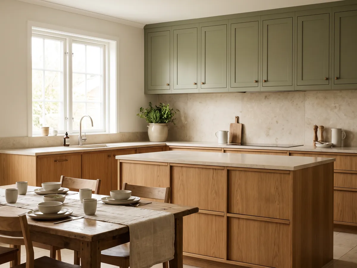
Kitchen schemes revolve around the big, semi-permanent surfaces, cabinets, worktop, and backsplash, so they are the highest-stakes color decision in the house. A safe and popular approach pairs a warm wood or a muted cabinet color, sage green, deep navy, or warm off-white, with a pale stone worktop and one metal accent. That gives you a scheme with warmth, a considered secondary, and a small dose of shine.
Because cabinets and stone are expensive and installed once, the kitchen is where previewing a scheme pays off most. Testing a navy versus a sage cabinet, or a warm wood versus a cool white, on your actual kitchen removes the biggest risk in any renovation. You can design a kitchen scheme with AI before ordering anything, and a modern kitchen shows one cohesive direction.
See any color scheme on your own room
 Before
New scheme
Before
New scheme
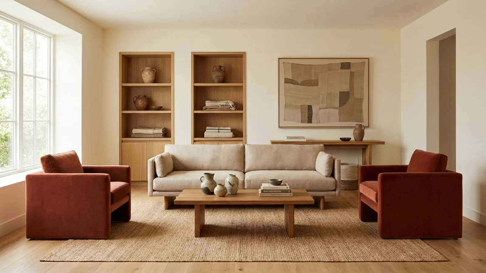
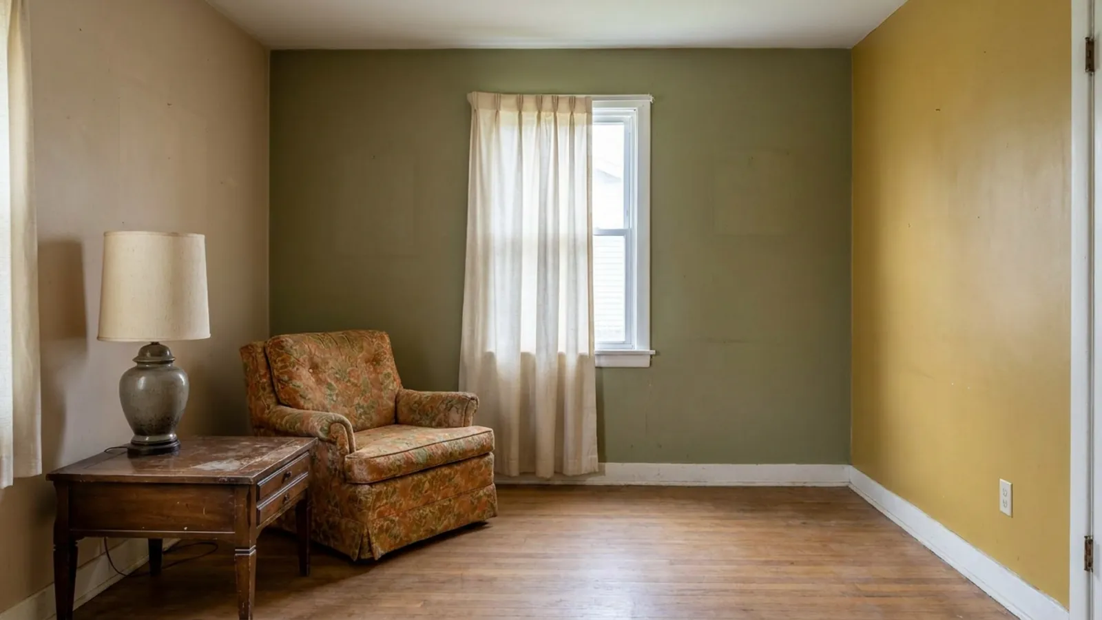
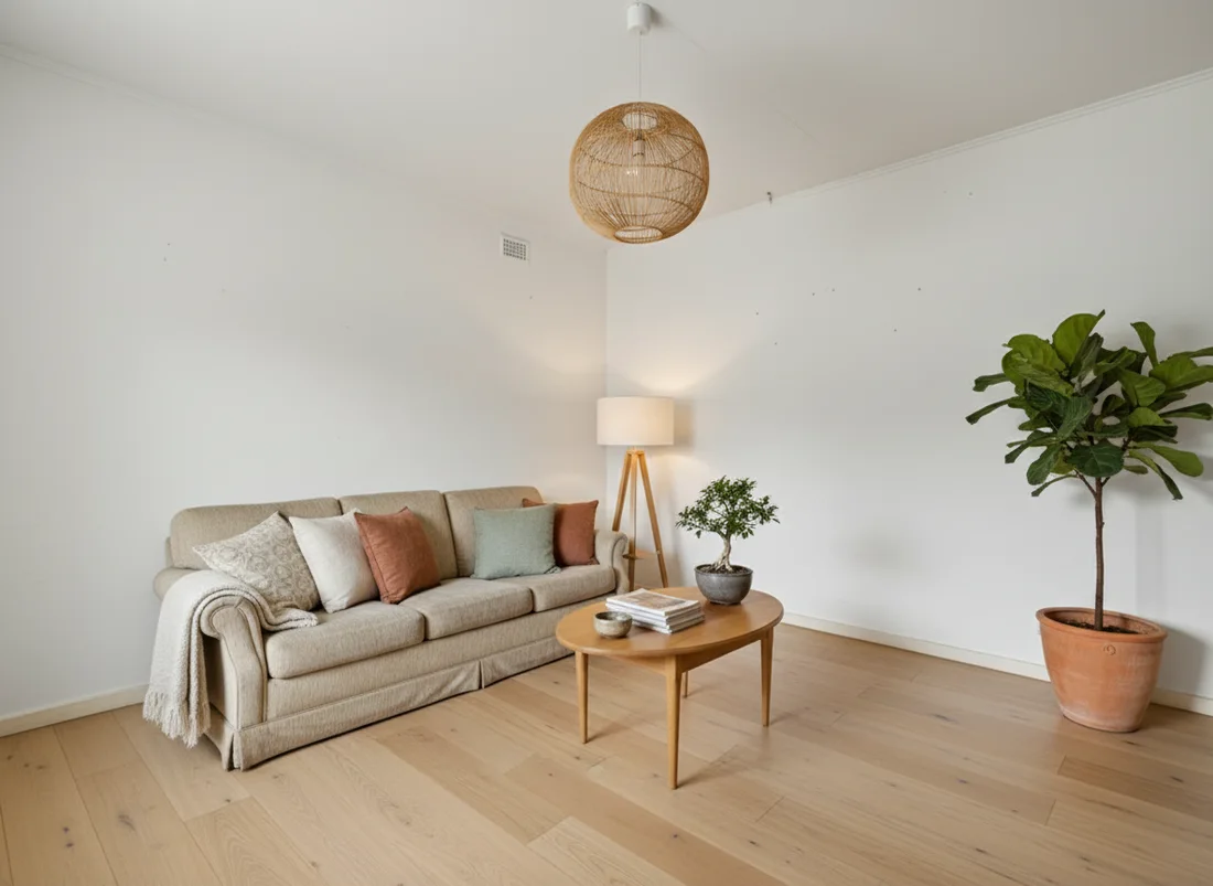
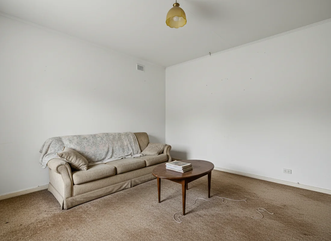
Color is the one design decision you should never make from a screen alone, because undertones and light change everything at full scale. The safest way to choose is to see the scheme on your actual room. Upload a photo and render it in a few candidate palettes, keeping your layout and windows, and compare them side by side in your room's real light.
The first render is free with no signup, so you can test a warm scheme against a cool one, a bold accent against a subtle one, and pick the one that genuinely works before you buy a single tin of paint. Try a color scheme on your own room and see the 60-30-10 rule, the right temperature, and the correct undertone come together on your real space.
Frequently asked questions
What is the 60-30-10 rule in interior design? +
It is a proportion guideline for balancing three colors in a room. Roughly 60 percent is a dominant color on walls and large furniture, 30 percent is a secondary color on upholstery or curtains, and 10 percent is an accent on cushions, art, and small objects. The numbers are a guide for balance rather than an exact measurement, and they work with any style. Keeping the accent small is what makes a bold color feel intentional instead of overwhelming.
What are the main types of color schemes? +
The four most common are monochromatic, analogous, complementary, and triadic. Monochromatic uses one hue in different shades and tones, analogous uses colors that sit next to each other on the color wheel, complementary pairs colors from opposite sides, and triadic uses three evenly spaced colors. Monochromatic and analogous schemes read calm and cohesive, while complementary and triadic schemes add contrast and energy.
How do I choose a color scheme for a room? +
Start by deciding how you want the room to feel, then choose a base temperature that supports it, warm for cozy, cool for calm, or a flexible neutral. Pick a dominant color, a supporting secondary, and one accent, and apply them in roughly a 60-30-10 split. Always check your colors in the actual room and light before committing, because undertones shift with daylight. Seeing the scheme on your real room removes most of the guesswork.
What colors go well together in a room? +
Colors that share an undertone or a clear relationship on the color wheel tend to work together. Neutrals with a single warm or cool accent are the safest starting point, analogous pairings like blue and green feel restful, and complementary pairings like teal and terracotta feel lively when one stays dominant. The reliable move is to let one color lead and keep the rest in supporting and accent roles.
How many colors should one room have? +
Most balanced rooms use about three colors, which is the basis of the 60-30-10 rule, though each can appear in several shades and tones. Adding more than three main colors makes a room harder to keep cohesive, while using tints and textures of your three keeps it interesting without feeling busy. Fixed elements like flooring and counters count toward your palette, so factor them in early.
Should the whole house use the same color scheme? +
Not the exact same colors, but a shared tonal language that lets rooms flow into one another. A common approach is to keep a consistent set of neutrals and undertones throughout, then vary the accent color room by room. Stand in doorways and note which spaces are visible at once, and make sure those neighboring colors agree. This keeps a home feeling coordinated without every room looking identical.
 After
After
 Before
See it on your own room
Your room, redesigned
Upload one photo and watch your room restyled in a wide range of designer looks. Your walls, windows and layout stay exactly as they are.
Try it free, no signupOne photo. In seconds. No signup.