restylai blog
Interior Design Rules Explained: 3-5-7, 70/30, 60-30-10
Updated July 19, 2026 · by the restylai team
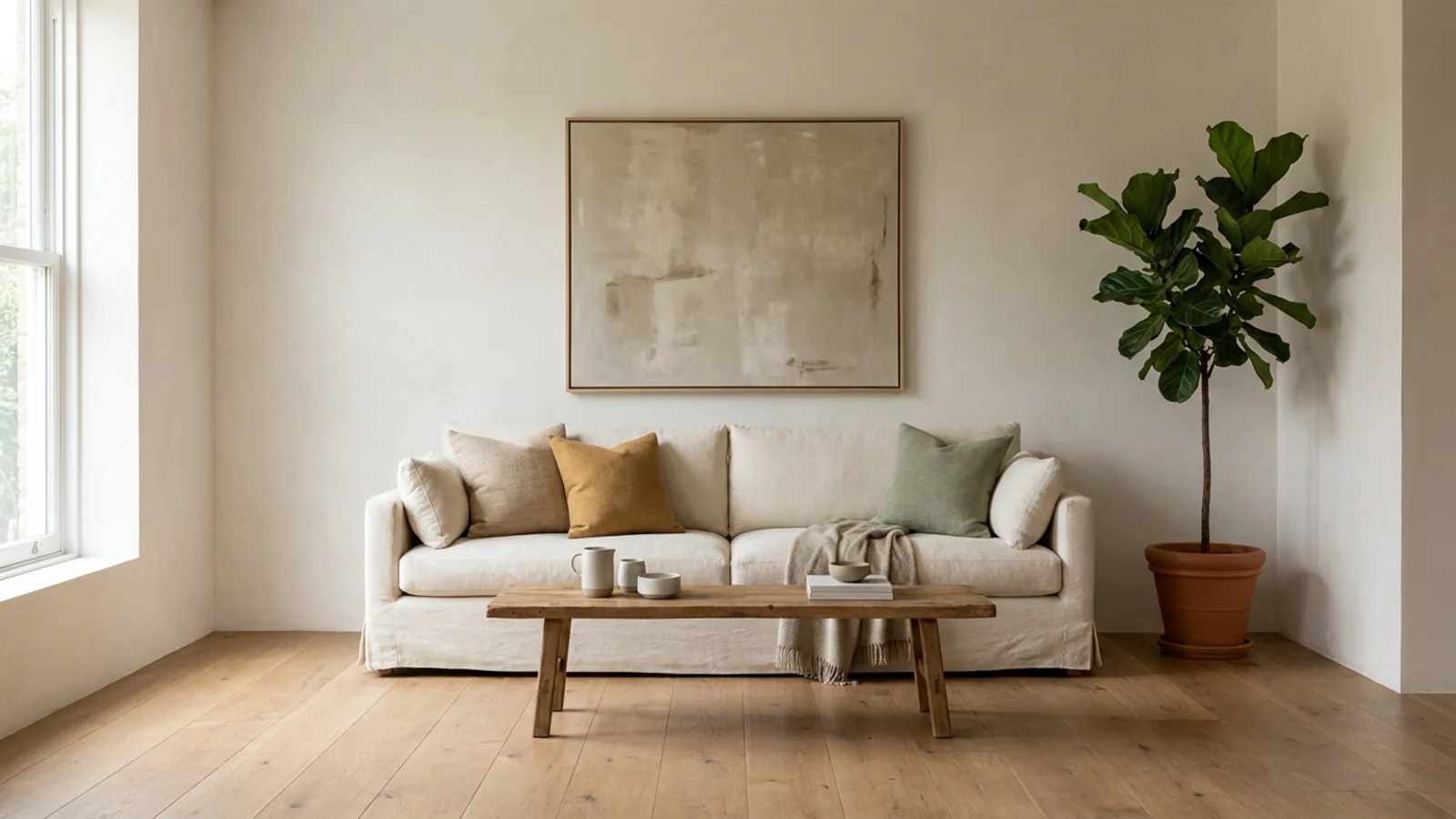
Interior design has a reputation for being pure intuition, but a lot of what makes a room feel right comes down to a handful of simple rules about balance, proportion, and rhythm. Learn them and you stop guessing: you can look at a room that feels off and diagnose why, and look at a blank one and know where to start. The catch is that these are guidelines, not laws, and knowing when to bend them matters as much as knowing them.
This guide explains the design rules that actually work, 60-30-10, 70/30, 3-5-7, the golden ratio and 2:3, the rule of three, scale and negative space, and layered lighting, then covers how to test them on your own room and when to break them.
What interior design rules really are, and why most are guidelines
Before the numbers, one honest framing: interior design rules are not strict laws, they are shortcuts that codify what tends to look balanced. They exist because certain proportions and rhythms are pleasing to the eye across almost every style, so packaging them as a rule makes them easy to remember and apply. A rule like 60-30-10 is a starting point that gets you most of the way to a balanced room without years of training.
Treat them as tools, not tests. The best-designed rooms usually follow several of these rules at once, often without the designer consciously counting, and the best designers break them deliberately when a room calls for it. Use the rules to get a room to 90 percent, then trust your eye for the last 10. And because they are all about how a room reads at full scale, the easiest way to see them work is to apply them to a photo of your own space, which you can do when you redesign a room from a photo.
The 60-30-10 rule for color balance
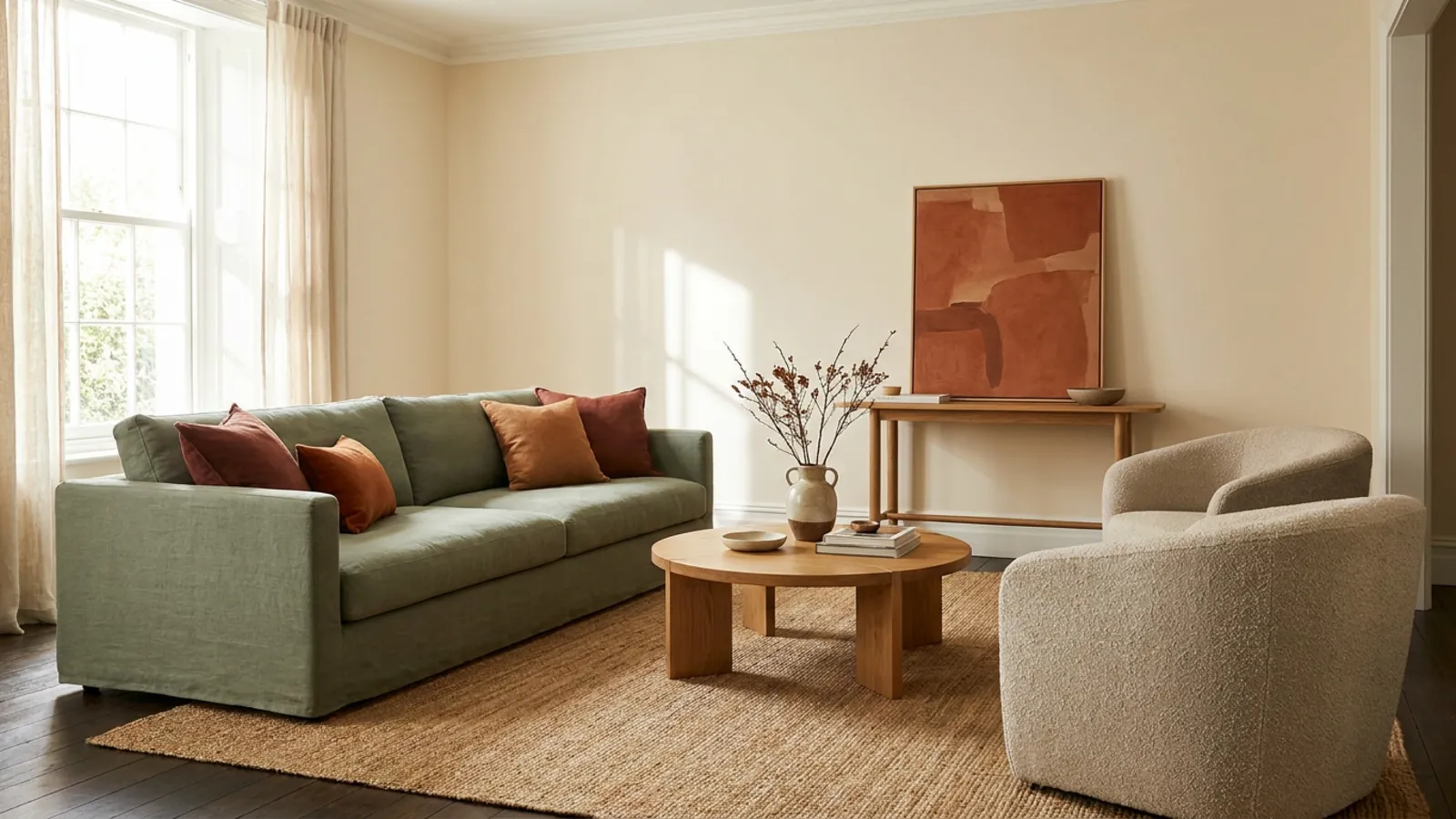
The most famous rule, and the most useful, is about color proportion. The 60-30-10 rule says about 60 percent of a room should be a dominant color, on the walls and large surfaces, 30 percent a secondary color, on upholstery and curtains, and 10 percent an accent, in cushions, art, and small objects. That split creates a clear color hierarchy, so the room feels cohesive rather than flat or busy.
The reason it works is that it caps the loud color at roughly a tenth of the room, which is exactly where most color schemes go wrong, too much of a bold tone. It adapts to any palette, from all-neutral to vivid, and it is the single most reliable way to make a combination of colors feel intentional. It pairs naturally with a full color scheme approach, and it is the rule to reach for first.
The 70/30 rule and how it differs from 60-30-10
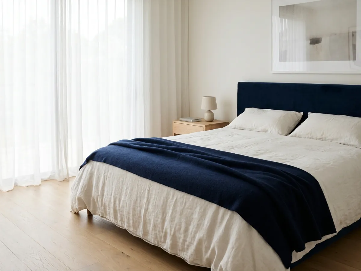
A simpler cousin of 60-30-10 is the 70/30 rule, a two-part balance where roughly 70 percent of a scheme is a dominant color or material and 30 percent is a contrasting accent. Where 60-30-10 uses three colors, 70/30 uses two, which gives a stronger, cleaner distinction between the main tone and the accent.
The 70/30 split also applies beyond color, to materials and styles: 70 percent of a room in one material or era and 30 percent in a contrasting one keeps a mix feeling intentional rather than chaotic. It suits rooms that want one confident anchor and plenty of breathing room, and it is a good choice when 60-30-10 feels too fussy for a pared-back space. Think of it as the minimalist's balance rule.
The 3-5-7 rule for grouping and styling
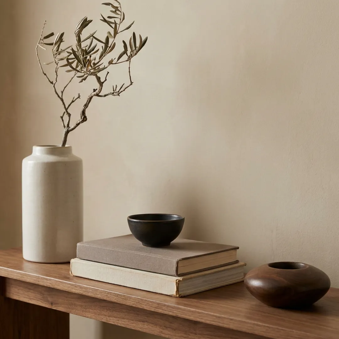
When it comes to styling surfaces, the 3-5-7 rule is the one to know. It suggests arranging objects in odd numbers, three, five, or seven, rather than in pairs. Odd groupings give the eye a natural center and a gentle rhythm, so they read as more relaxed and curated than symmetrical pairs, which can feel static. Most designers pair it with a scale cue: a larger anchor piece, medium supporting pieces, and small details, with the heights varied so the group has movement.
It works best on shelves, mantels, coffee tables, and gallery walls, the spots where styling makes or breaks a room. A word of honesty: grouping in odd numbers is a genuine, long-standing principle, and the catchy 3-5-7 label is just a recent way to package it. Use it lightly, because applied to every surface it can look forced. On the surfaces that matter, though, it is a reliable way to make a vignette feel considered.
The golden ratio and the 2:3 rule for proportion
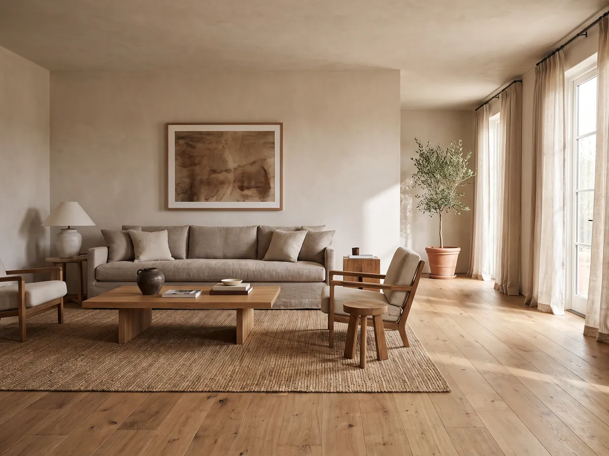
For layout and proportion, designers lean on the golden ratio, a proportion of roughly 1 to 1.6 that shows up throughout nature and tends to feel naturally pleasing. Its practical version is the 2:3 rule. In a room, that often means dedicating about two-thirds of the space to the main furniture zone and one-third to open space, or sizing a coffee table to about two-thirds the length of the sofa in front of it.
Unlike the color rules, this one is about size and space rather than hue, which makes it invaluable for the decisions people find hardest: how big should the rug be, how long the table, how much room to leave open. Aiming for a two-thirds to one-third relationship between filled and empty, or between a piece and the piece it sits with, is a quiet trick that makes a room feel proportioned rather than either sparse or crammed.
The rule of three and finding a focal point
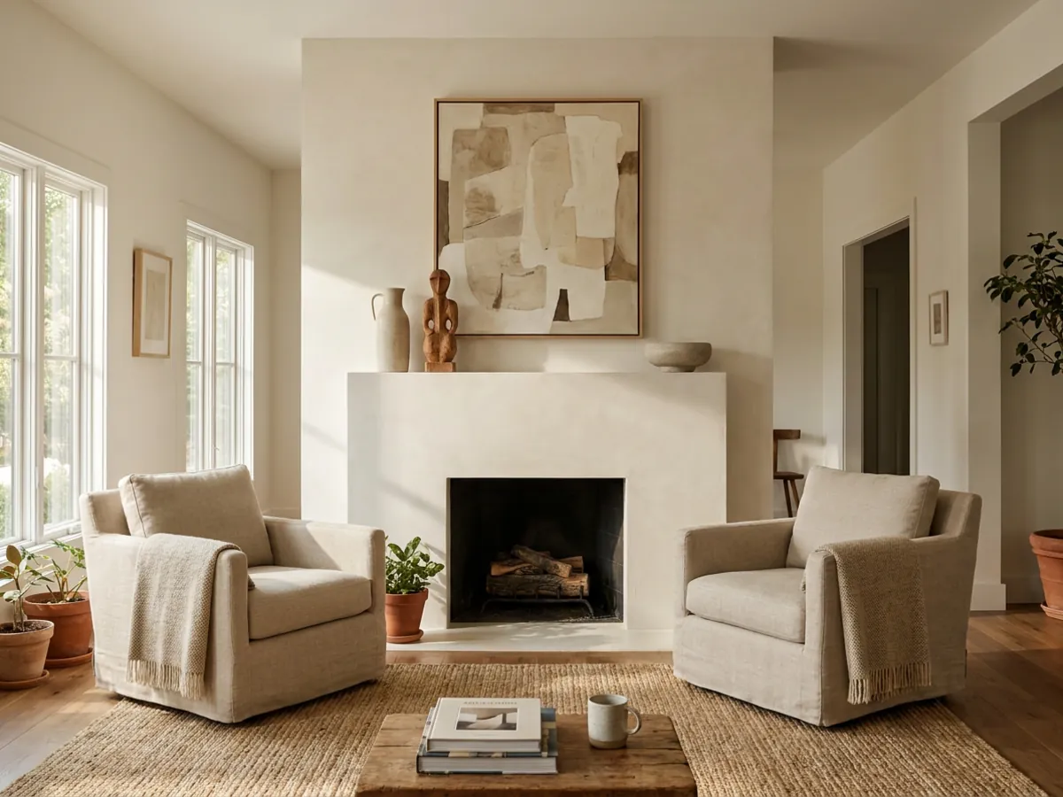
Two related principles govern where the eye goes. The rule of three, a broader version of 3-5-7, holds that things arranged in threes are more visually appealing and memorable, whether that is three colors, three textures, or three objects. And every well-designed room needs a focal point, one thing the eye lands on first, a fireplace, a bed, a striking piece of art, a window with a view, so the room has an anchor and a sense of order.
The two work together: establish the focal point, then arrange the supporting elements, often in threes, around it. A room without a focal point feels aimless, no matter how nice the individual pieces are, because the eye has nowhere to settle. If your room feels busy but unfocused, the fix is usually to choose or create one clear focal point and let everything else support it rather than compete.
Scale, proportion, and the power of negative space
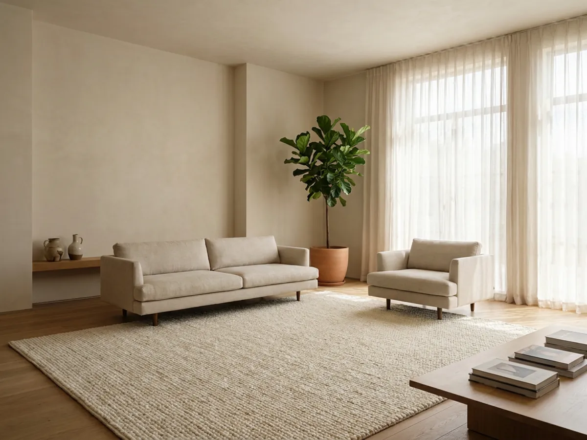
Underneath all the numbered rules sit two fundamentals: scale and negative space. Scale is about choosing furniture sized to the room, not too big, which crowds, and not too small, which looks lost, and mixing a few different sizes so the room has variety rather than a flat sea of medium pieces. Getting scale right is the difference between a room that feels comfortable and one that feels off in a way people struggle to name.
Negative space, the empty space around and between objects, is just as important and far more often neglected. Leaving deliberate empty space gives a room room to breathe, lets the pieces you chose stand out, and reads as calm and considered. The instinct in decorating is to fill, but the most sophisticated rooms are defined as much by what is left empty as by what is placed. Respect the gaps, and everything you do put in the room works harder.
Layered lighting: ambient, task, and accent
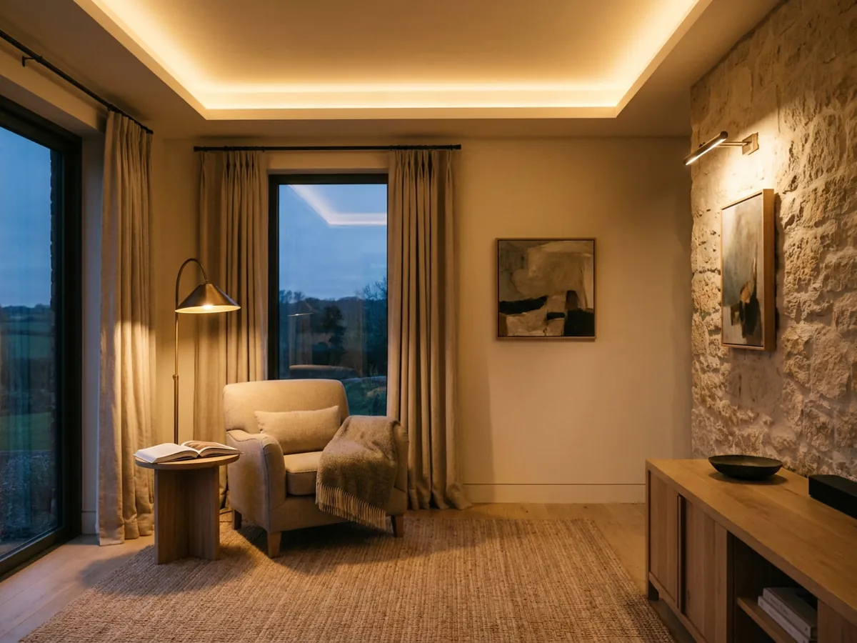
The most overlooked design rule is about light. Good rooms use three layers of it. Ambient light is the overall glow that lets you see the whole room, usually from ceiling fixtures or general sources. Task light is focused where you do things, a reading lamp, under-cabinet strips, a desk light. Accent light highlights a feature, a wall washer, a picture light, a lamp grazing a textured wall.
A room lit by a single overhead source feels flat and unflattering, no matter how well it is furnished, because there is no depth to the light. Layering the three, and putting them on separate switches or dimmers so you can shift the mood, is one of the highest-impact and most underused moves in design. It costs relatively little and transforms how a room feels at every hour, which is why designers treat lighting as a first-class decision rather than an afterthought.
How to test a design rule on your own room
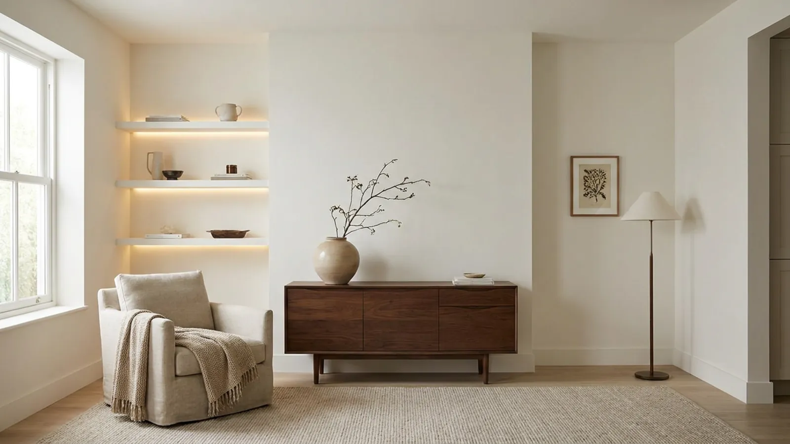
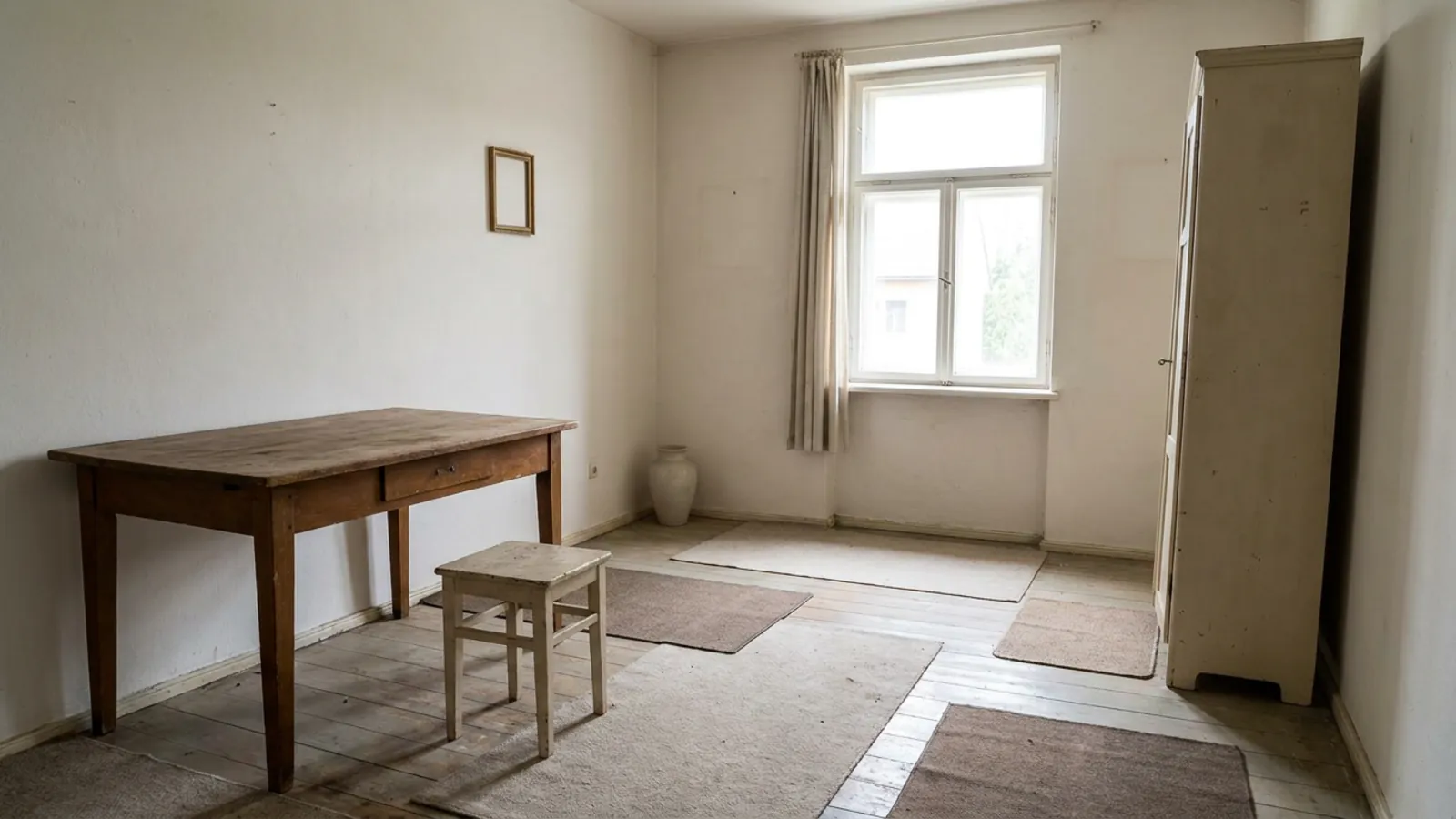 Before
Rules applied
Before
Rules applied
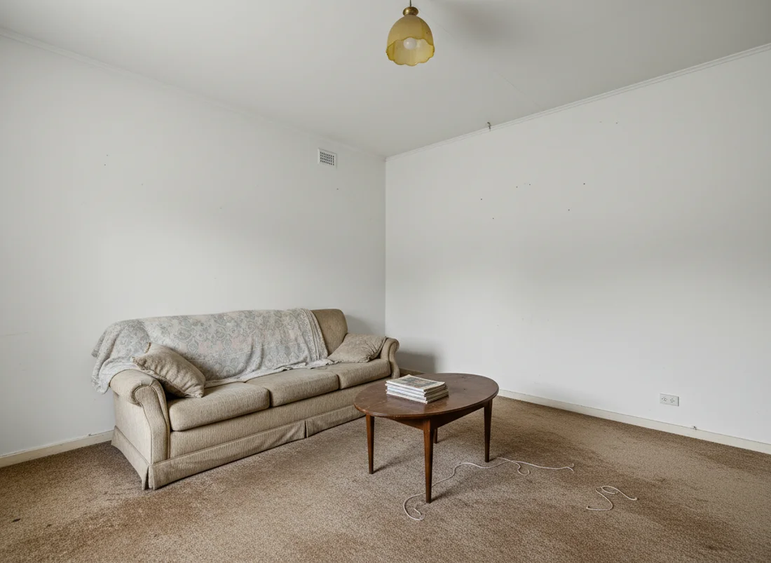
Rules are easier to trust when you can see them work on your own space. Upload a photo and preview your room with a 60-30-10 palette, a clear focal point, better scale, or layered lighting, keeping your layout and windows, and compare it against the original. Seeing the balance shift on your actual room makes each rule concrete in a way that reading about it cannot.
The first render is free with no signup, so you can test one rule at a time and watch the room improve. You can plan the layout and proportions with an AI room planner, furnish an empty room with virtual staging, then restyle your own room with the rules applied and keep what genuinely improves it.
When to break the rules, and why designers do
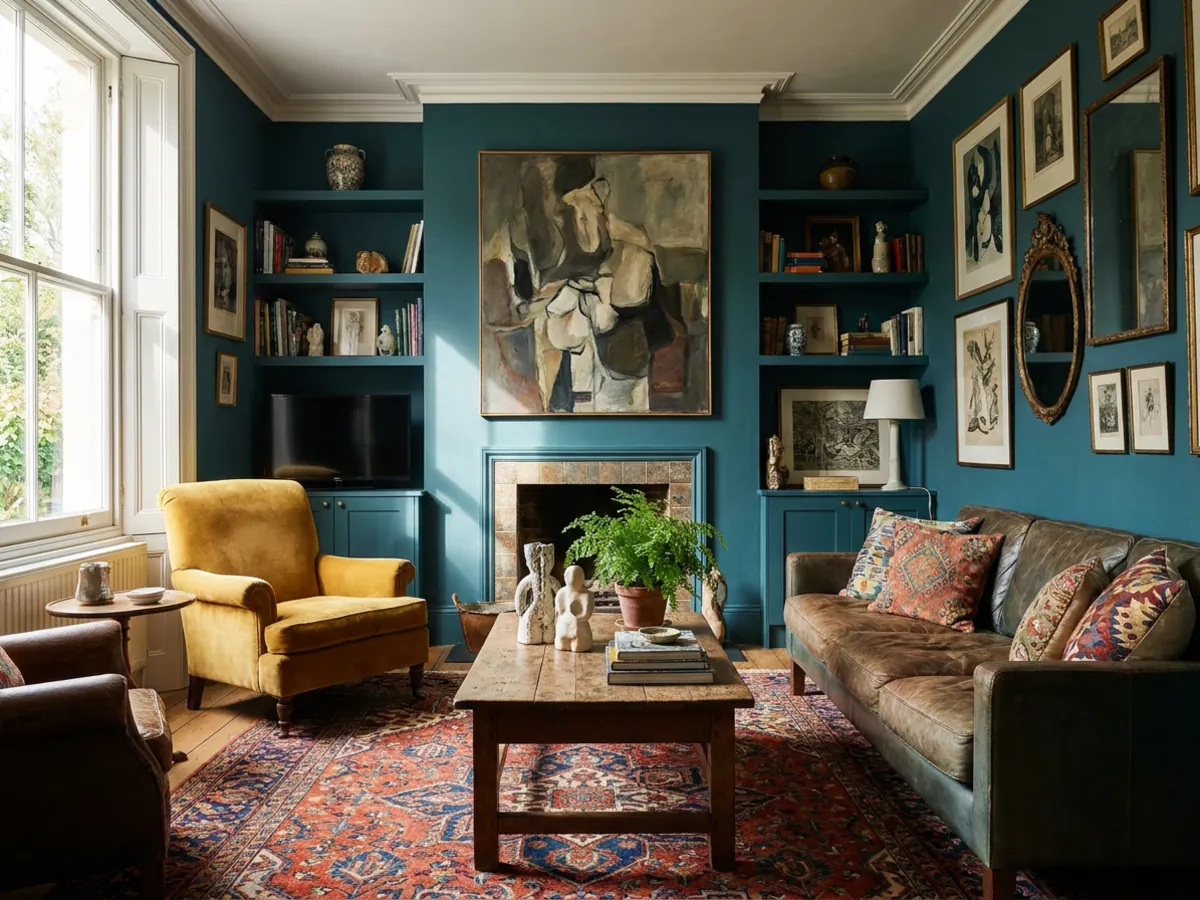
Here is the part the rule lists leave out: the best rooms often break a rule on purpose. A drenched, single-color room ignores 60-30-10 and looks stunning. A perfectly symmetrical room ignores the odd-number rule and feels grand and formal. A deliberately overscaled piece breaks the scale guideline and becomes the whole point of the room. Rules describe what usually works, and usually is not always.
The key is to break a rule knowingly, for a clear reason, rather than by accident. Designers break rules when they want a specific effect, drama, intimacy, formality, surprise, that the rule would prevent, and they keep the other rules intact so the room still reads as intentional. Learn the rules first, use them to build a solid, balanced base, and then break the one that is standing between your room and the feeling you actually want. A rule broken with intent is a design decision; a rule broken by accident is just a mistake.
Frequently asked questions
What is the 3-5-7 rule in interior design? +
The 3-5-7 rule is a styling guideline that suggests arranging objects in odd numbers, three, five or seven, rather than in pairs. The idea is that odd groupings give the eye a natural center and gentle rhythm, so they read as more relaxed and curated. Many designers pair it with a scale cue, using larger anchor pieces, medium supporting pieces and small details, and varying the heights. It works best on shelves, mantels, coffee tables and gallery walls.
What is the 60-30-10 rule in interior design? +
The 60-30-10 rule is a color balance formula: about 60 percent of a room is a dominant color on walls and large surfaces, 30 percent is a secondary color on upholstery and curtains, and 10 percent is an accent in cushions, art and small objects. The split creates a clear color hierarchy so a room feels cohesive rather than flat or busy. It is a guideline, not a strict requirement, and it adapts easily to any palette.
What is the 70/30 rule in interior design? +
The 70/30 rule is a simpler two-part balance where roughly 70 percent of a scheme is a dominant color or material and 30 percent is a contrasting accent. Compared with the three-color 60-30-10 rule, it gives a stronger, cleaner distinction between the main tone and the accent. It suits rooms that want one confident anchor and plenty of breathing room.
What is the 2:3 rule or golden ratio in interior design? +
The 2:3 rule is a practical version of the golden ratio, a proportion of roughly 1 to 1.6 that tends to feel naturally pleasing. In a room it often means dedicating about two-thirds of the space to the main furniture zone and one-third to open space, or sizing a coffee table to about two-thirds the length of the sofa. It is most useful for layout and proportion decisions rather than color.
Is the 3-5-7 rule real, or just a trend? +
Grouping in odd numbers is a long-standing, genuine styling principle, and the 3-5-7 label is a recent, memorable way to package it. Designers do rely on odd groupings, though they treat the exact numbers as a guide rather than a strict count. Used lightly it helps, and it can look forced if applied to every surface.
What is the most important rule in interior design? +
There is no single rule every designer agrees on, but balance and a clear focal point come up most often. Balance keeps no one part of a room overpowering the rest, and a focal point gives the eye somewhere to settle. The number-based rules like 60-30-10 and the 2:3 ratio are tools that help you reach that balance.
Can you use more than one design rule in the same room? +
Yes, most well-designed rooms combine several. A common approach is a 60-30-10 palette for color, the 2:3 ratio for layout, and the rule of three for styling, all in one space. The rules cover different decisions, so they tend to reinforce rather than conflict with each other.
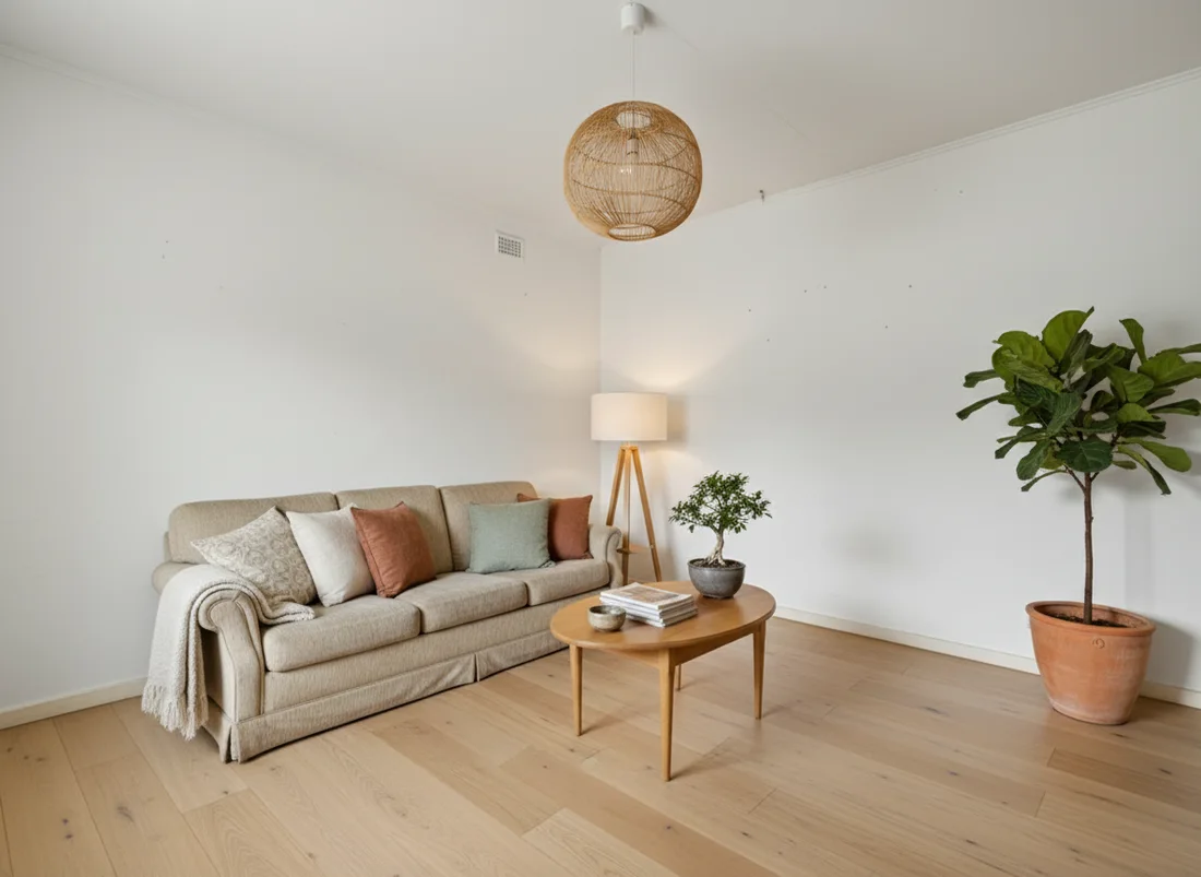 After
After
 Before
See it on your own room
Your room, redesigned
Upload one photo and watch your room restyled in a wide range of designer looks. Your walls, windows and layout stay exactly as they are.
Try it free, no signupOne photo. In seconds. No signup.