restylai blog
Living Room Furniture Layout: Arrangements That Work
Updated July 31, 2026 · by the restylai team
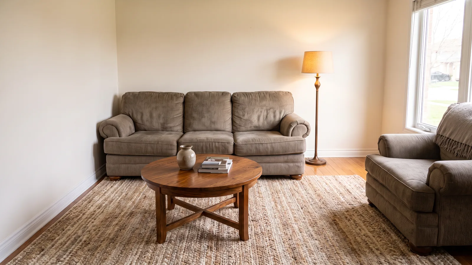
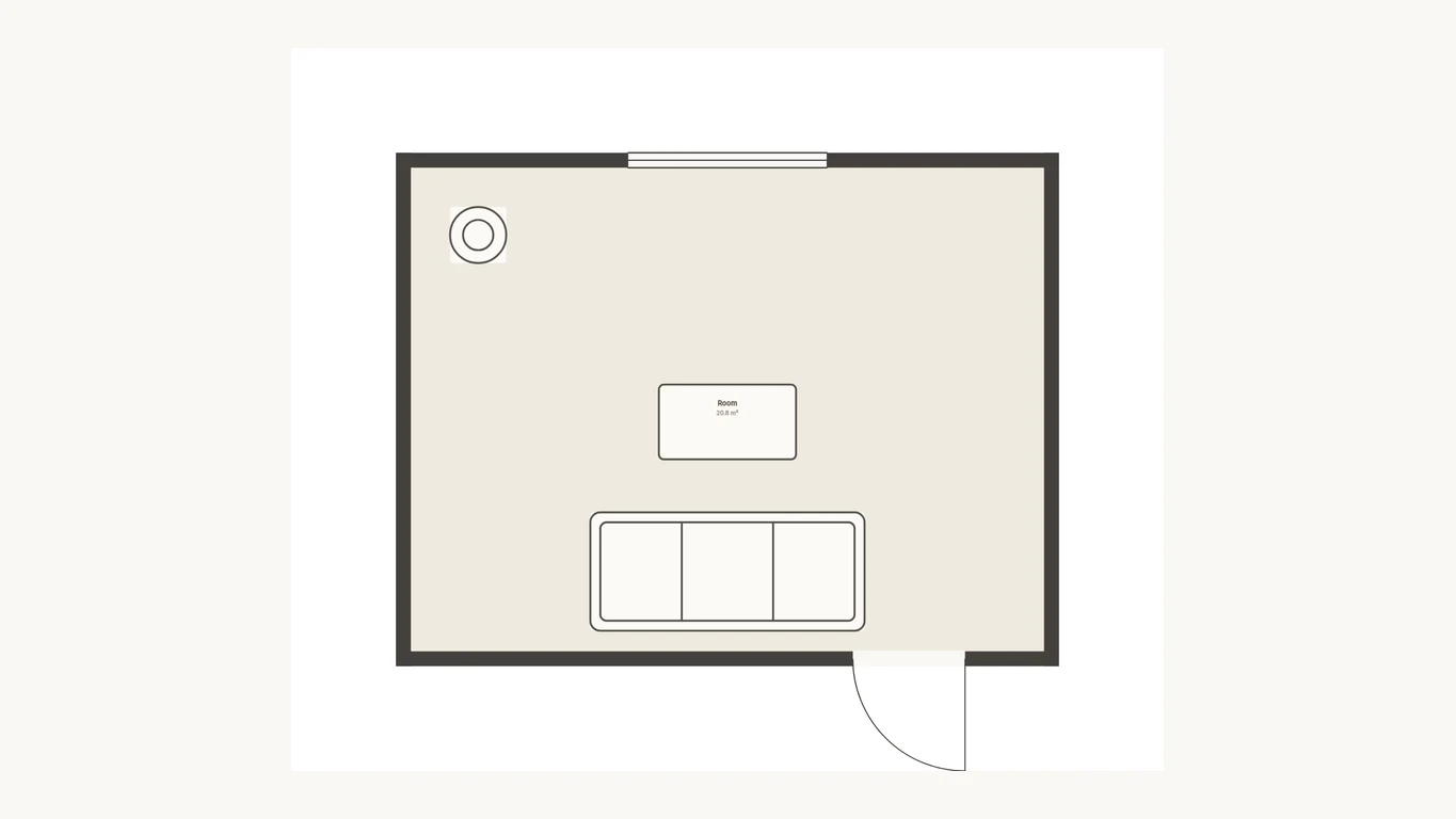
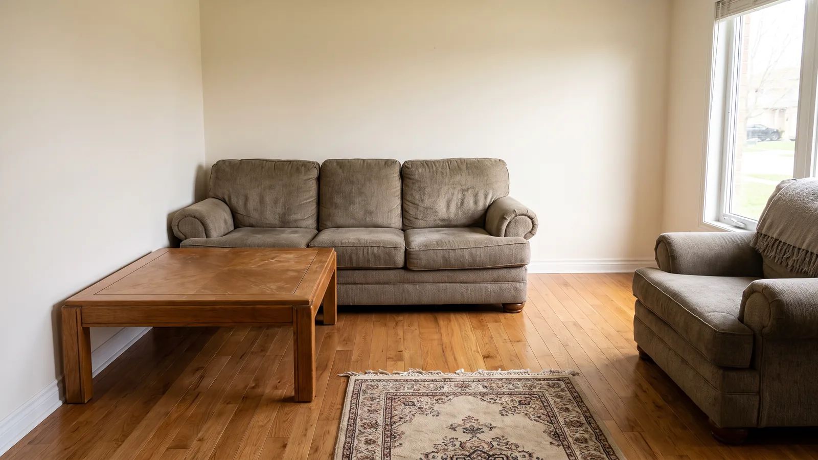 Before
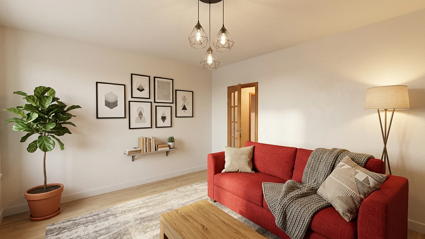
Rearranged
Before
Rearranged
Most living rooms that do not work are not too small. They have furniture sitting in the path people walk, and no amount of restyling fixes that.
This covers the constraints that decide a layout before you touch anything, the clearances that separate a room you can move through from one you edge around, five arrangements with the room each suits, and what to do with narrow rooms, awkward rooms, and rooms with two focal points fighting each other.
Every figure here is a typical working number rather than a rule. The useful ones are surprisingly few, and they explain almost every layout that feels wrong.
Start with the room, not the furniture
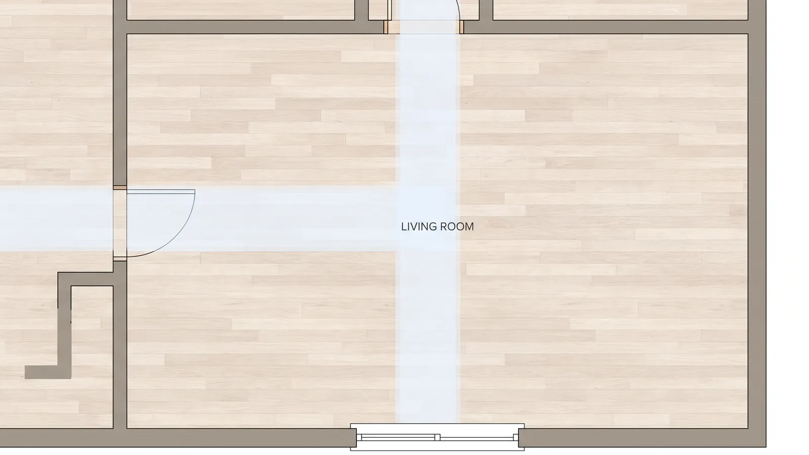
Five fixed things decide the layout, and none of them are furniture: where the doors are and which way they swing, where the windows are, what the focal point is, where people have to walk, and where the power outlets sit.
Map the routes first. Draw the path from each doorway to every other doorway and to the window, keep each one about 90 cm wide, and arrange furniture in what is left. That single step explains most awkward rooms: the furniture is standing in the corridor.
It also reframes what a small room is. A 3.5 x 4.0 m room with one door has a lot of usable floor. The same room with a door on each of three walls has almost none, because the routes cross in the middle and take the best part of it. The area is identical and the rooms are not comparable.
Do this on paper rather than in your head. The floor plan creator draws the room to scale so the routes are visible rather than imagined, which matters because people consistently underestimate how much floor a route consumes.
The clearances that decide whether a layout works
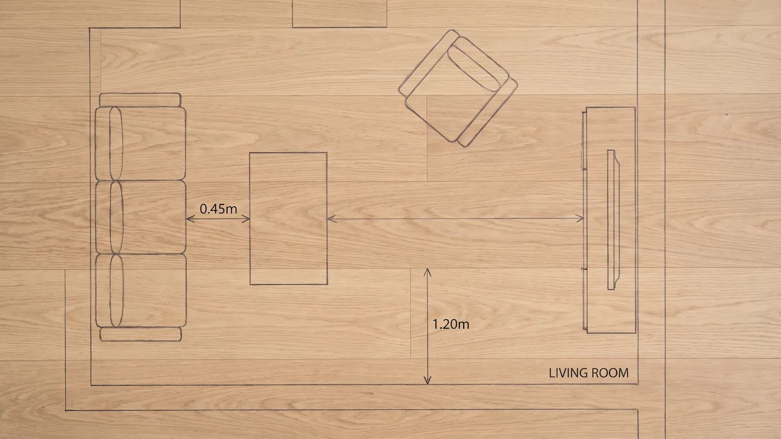
Six numbers cover nearly everything:
- 90 cm for a main walkway, meaning a route you use every day.
- 60 cm for a secondary squeeze-past, acceptable occasionally and unpleasant daily.
- 40 to 45 cm between a sofa and a coffee table: close enough to reach a cup, far enough to pass.
- Coffee table around two thirds the sofa length. A 220 cm sofa suits a table of roughly 120 to 150 cm.
- 75 to 90 cm in front of anything that opens, which includes a media unit with drawers.
- 1.5 to 2.5 times the screen diagonal for television viewing distance. A 140 cm screen wants 2.1 to 3.5 m.
These matter more than furniture size, and that is the part people get backwards. A room can hold the furniture perfectly and still be miserable, because holding it and moving through it are different tests.
The quickest test needs no tape measure: if you turn sideways to get past something, the gap is wrong. You will do it automatically for years without noticing, and it is the single most common reason a room feels smaller than it is. Standard room dimensions has the full set of clearances room by room.
Five layouts that work, and the room each suits
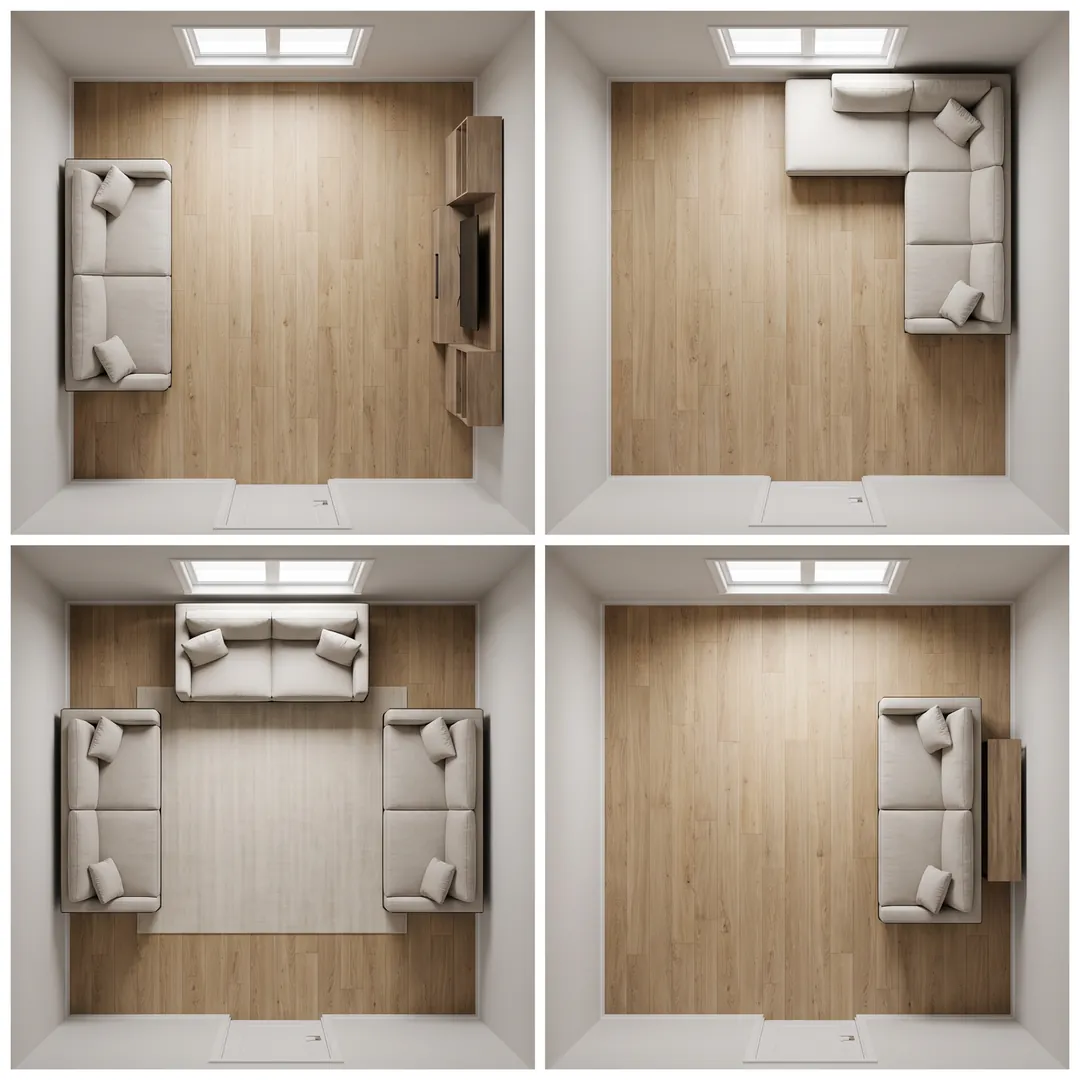
Each of these is a real arrangement with a real weakness. The weakness is the useful part.
| Layout | Suits | Needs | Its weakness |
|---|---|---|---|
| Sofa facing the focal point | Squarish rooms, 3.5 m short wall and up | One clear focal wall | Wastes the corners |
| L-shape with a sectional | Small rooms | Two adjacent free walls | Commits the room to one orientation permanently |
| Two sofas facing | Wide or formal rooms, 4.0 m plus | 4.0 m across with 90 cm between them | Awkward with a television, half the seats face away |
| Floated sofa with a console behind | Large or open-plan rooms | 60 to 75 cm clear behind the sofa | Below 60 cm it reads as a mistake, not a choice |
| Long wall run | Narrow rooms under 3.0 m wide | One uninterrupted long wall | Only ever one seating orientation |
The floated sofa is worth expanding, because it fails more often than the others. Off the wall by 30 cm it looks like the sofa was pushed and forgotten. At 60 to 75 cm with a console table behind it, the gap reads as a deliberate walkway and the room gains a route it did not have. There is no middle ground: commit to the clearance or put the sofa against the wall.
Small living rooms
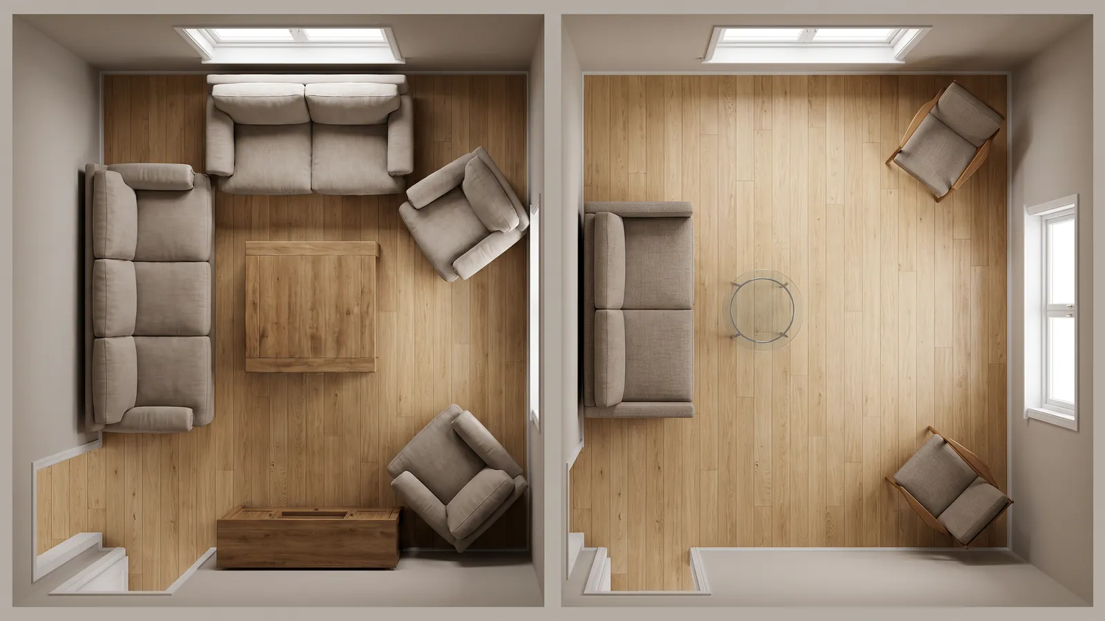
Six tactics that work, each for a reason worth knowing:
- Furniture on legs with visible floor beneath. Floor you can see reads as space. A sofa on legs and a sofa to the floor take identical footprints and the room feels different.
- One clear sightline from the door. Being able to see across the room to the far wall does more for perceived size than any single piece of furniture.
- Slim or absent arms. Sofa arms cost 10 to 15 cm each. Losing both reclaims 20 to 30 cm, which is often the difference between fitting and not.
- A round coffee table. It removes the corner you keep catching your shin on, and it lets the walkway pinch to 35 cm at the narrowest point without feeling blocked.
- Wall-mount the television. A media unit takes 40 to 45 cm of depth. The wall takes none.
- A rug large enough to sit under the front legs. An undersized rug visually shrinks the room by drawing a small box in the middle of it.
Then the part the category will not say: past a certain point the answer is fewer pieces, not cleverer arrangement. A room with a 3.0 m short wall holds a sofa and one chair with a working route. Adding a second armchair will physically fit and will cost you the route, and no arrangement recovers it. Small apartment layout ideas covers the whole-home version of that trade.
Narrow and awkward rooms
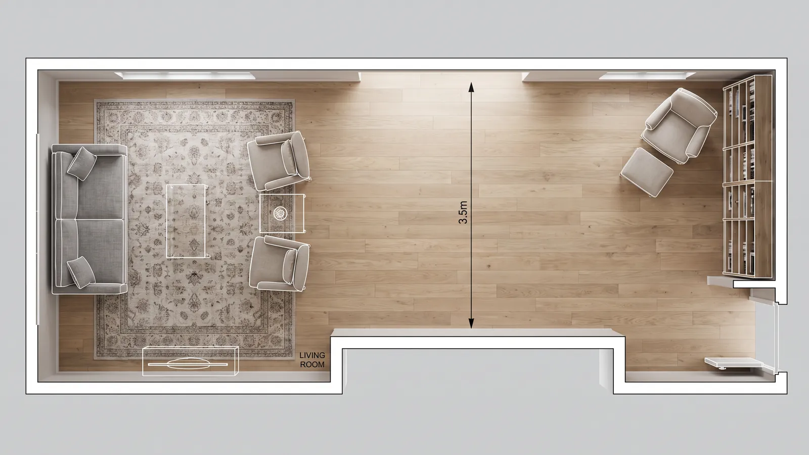
The long narrow rectangle. The instinct is to line both long walls, which turns the middle into a corridor and the room into a train carriage. Break it into two zones instead: a seating group at one end, something else at the other, a reading corner or a small desk, with a single route along one side connecting them. Two small good rooms beat one long bad one.
A door in the middle of every wall. Accept a smaller usable island. Float the seating in the centre, keep every route around the outside, and stop trying to use the walls, because the doors have already claimed them.
The room with no walls at all, meaning an open-plan corner. Define it with the rug and the back of the sofa. The rug's edge is the room's edge, and a sofa back is the only wall you get.
A radiator under the only good window. Do not block it with a sofa back: you lose the heat and the sofa gets damaged. Leave 10 to 15 cm and use a low console, or move the seating and accept that the window wall is circulation.
When the fireplace and the television disagree
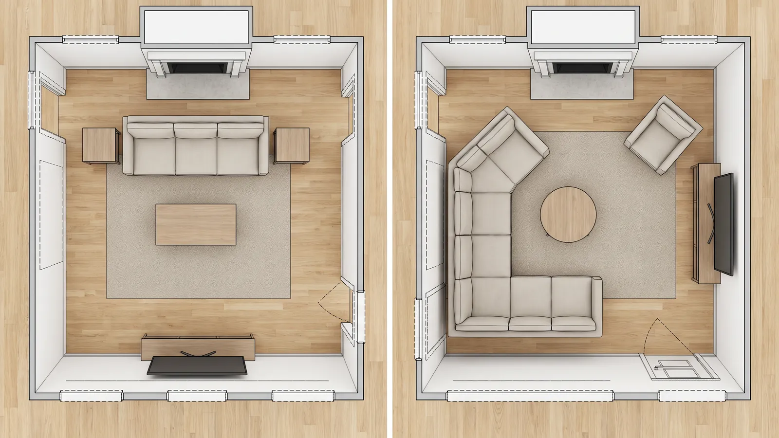
Two focal points on different walls is the most common unsolvable-feeling layout problem, and it has exactly three honest answers.
Angle the seating into the corner between them. The sofa sits diagonally so both walls are within view. It works, it costs floor area behind the sofa, and it suits rooms with a short wall of 4.0 m or more where that loss is affordable.
Pick one and demote the other. Choose the focal point you actually use, arrange square to it, and let the other be a feature you glance at. If you watch television four nights a week and light the fire twice a winter, the honest answer is the television, whatever the room's architecture implies.
Mount the television above the fireplace, with a real caveat. It puts the screen 15 to 30 cm higher than comfortable, which means looking up for a whole film, and heat rising from a working fire is not good for it. It solves the layout and creates a neck problem, and it is worth knowing that before drilling.
What does not work is splitting the difference, arranging halfway between the two so neither is properly faced. That is the arrangement most of these rooms end up in, and it is the one that makes the room feel permanently unresolved.
Rug size is not a detail
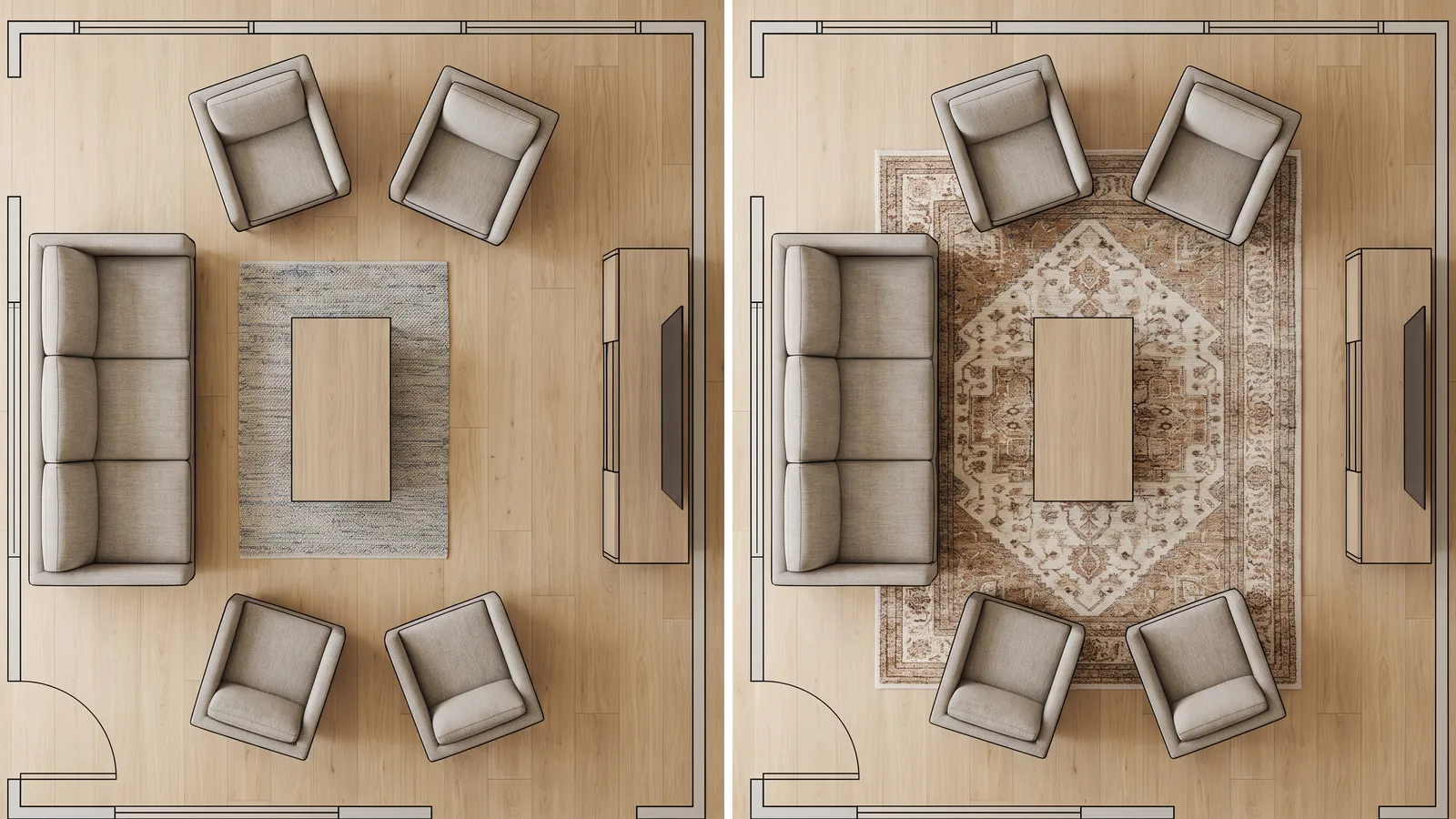
Of everything in this article, the mistake made most often and noticed least is a rug that is too small.
A rug's job is to draw a boundary around the seating group so the pieces read as one arrangement rather than as separate objects that happen to be nearby. A rug that touches nothing does the opposite: it draws a small rectangle in the middle of the floor, and the eye reads that rectangle as the size of the room.
Two sizes work. Either every leg of every piece sits on the rug, which needs a rug about 60 cm wider than the furniture group on each side, or at minimum the front legs of the sofa and the chairs sit on it. For a 220 cm sofa with two chairs, that is realistically 200 x 290 cm, and the common 160 x 230 cm is the size that looks right in a shop and floats once it is home.
The reason this is worth its own section is that it is expensive to get wrong and invisible while you are getting it wrong. Nobody looks at a room and thinks the rug is small; they think the room is. Measure the furniture group, add 60 cm each side, and buy that size even though it looks enormous rolled up.
Rugs, lighting and the details that hold a layout together
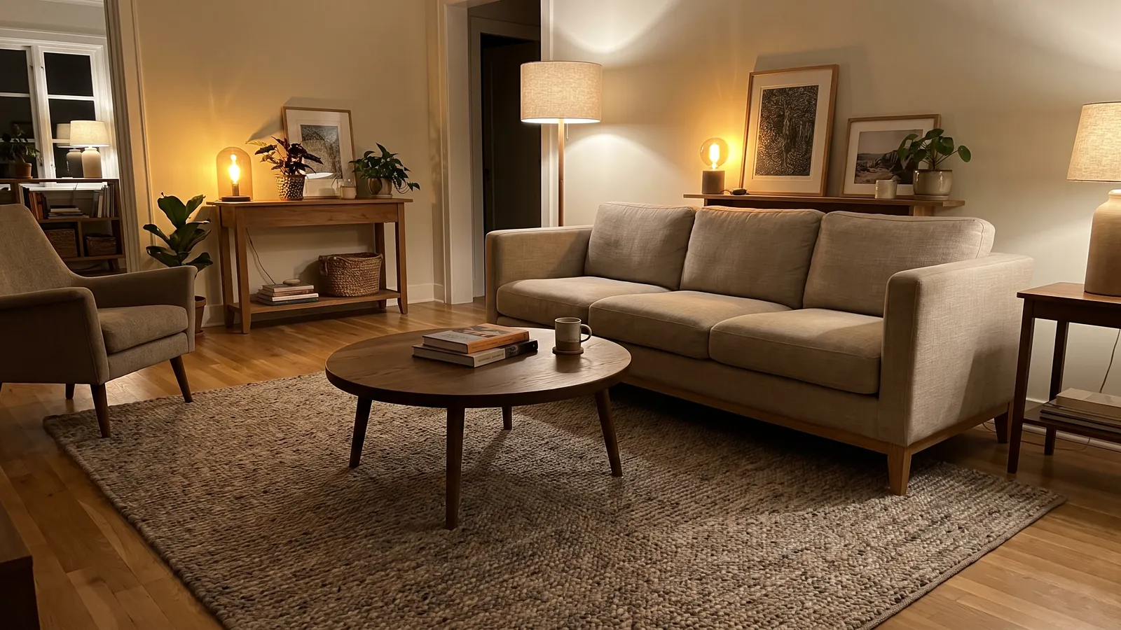
A correct arrangement still reads as unfinished without three things.
Light in three layers. Ambient for the room, task for reading, accent for the corners. A single ceiling light flattens every arrangement equally, which is why a well-planned room can still feel like a waiting area at night. Three sources at different heights is the minimum that reads as designed.
Surfaces within reach. Every seat wants somewhere to put a cup within about 60 cm. A seat without one is the seat nobody chooses, and that is usually the armchair people conclude they do not need.
Symmetry where the architecture is symmetrical. A room with a centred fireplace or matched windows takes symmetry well. A room with an off-centre door and one window fights it, and an asymmetric arrangement anchored by the rug will sit better. Match the arrangement to what the room already is.
For finished rooms in a particular direction, the living room ideas gallery is a reference, and you can redesign a room from a photo to see a style on your own space.
One room, rearranged
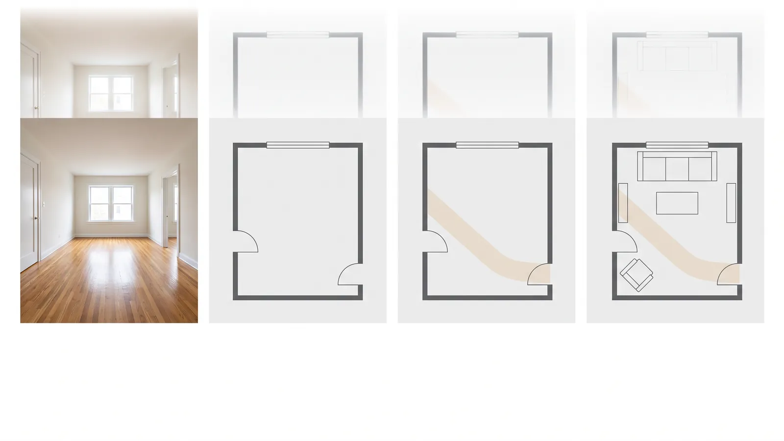
A real room, 3.8 x 5.2 m, so 19.8 m². Door in one corner, a second door to the kitchen mid-wall, and a window on the far short wall. Three openings, which is what makes it hard.
The routes, mapped first. Entry door to kitchen door runs diagonally across the room. Entry door to window runs along the length. Kept at 90 cm each, those two paths claim about 4.6 m² and, more importantly, they cross near the centre. The middle of this room is not usable, and knowing that before choosing furniture is the whole exercise.
What was there. A 230 cm sofa on the long wall facing a media unit, two armchairs in the window corner, a 130 x 70 cm coffee table. Everything fitted. The route from the entry to the kitchen ran between the sofa and the coffee table at 38 cm, so the shortcut everyone actually took was around the back of the armchairs, which is why one of them was permanently pushed askew.
The change. The sofa moved to the short wall under the window, which shortened the seating group but put it out of both routes. One armchair was removed. The coffee table came 8 cm closer to the sofa, giving 42 cm to reach across, and the diagonal route now runs behind the seating at 104 cm.
The result. One fewer chair and 19.8 m² unchanged, but both routes are clear and nothing is walked around. The armchair that left was the one with no surface within reach, which nobody had sat in for a year.
Test your layout before you move anything
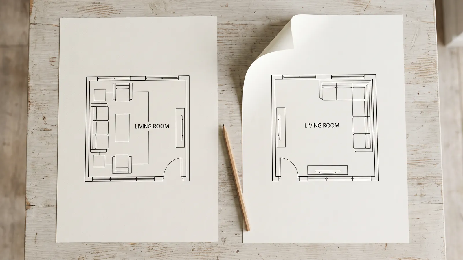
Moving a sofa on a plan takes two seconds. Moving it in life takes two people and a scraped floor, and you find out afterwards.
- Measure the room, including the door swings and the radiator. How to measure a room covers the method.
- Draw it to scale and mark the routes between every opening before adding anything.
- Place your actual furniture at true size, measured rather than remembered.
- Build two or three arrangements and compare them side by side from above.
- Walk each one at eye level, because an overhead view will not tell you that the sofa back cuts the window.
Everything up to the render is free and needs no account, which is the point here: you can try six arrangements and discard five at no cost. The photoreal image is the paid step, on a subscription. Open the planner and test your arrangement, or read how the floor plan creator works first.
Frequently asked questions
How do I arrange furniture in a small living room? +
Map the walkway first, then arrange the furniture in what is left. Choose slim pieces with visible legs, use one large rug rather than a small one, and accept that past a point the answer is fewer pieces rather than a cleverer arrangement.
How much space should be between a sofa and a coffee table? +
About 40 to 45 cm, which is close enough to reach a cup and far enough to walk past. The table itself should be roughly two thirds the length of the sofa, so a 220 cm sofa suits a table of 120 to 150 cm.
Should the sofa go against the wall? +
In small rooms usually yes. In large or open-plan rooms, floating it with a console behind defines the space better, but only with 60 to 75 cm of clearance behind it. At 30 cm it reads as a mistake rather than a choice.
How do I arrange a room with both a fireplace and a television? +
Pick the one you actually use, arrange square to it, and demote the other. The alternative is angling the seating into the corner so both are visible, which works but costs floor area behind the sofa.
What size rug should a living room have? +
Large enough that at least the front legs of the main seating rest on it. For a 220 cm sofa with two chairs that is realistically 200 x 290 cm, and a rug touching nothing makes the room read smaller than it is.
How wide should a walkway be in a living room? +
About 90 cm for a route you use daily and 60 cm for an occasional squeeze-past. The quick test needs no tape measure: if you turn sideways to get past something, the gap is wrong.
How do I lay out a narrow living room? +
Break it into two zones rather than lining both long walls, which turns the middle into a corridor. Put a seating group at one end and something else at the other, with a single route along one side.
Can I test a layout before moving furniture? +
Yes. Draw the room to scale, place the furniture at true size, and compare two or three complete arrangements from above and at eye level. Moving a sofa on a plan takes two seconds.
 After
After
 Before
Draw it, then walk it
Your plan, built and rendered
Draw the floor plan free in your browser, walk it in 3D, and one click renders the finished home in your style.
Draw your plan and see it realDraw it free. Walk it in 3D. No signup.